With all that we have to worry about these days, nearly everyone appreciates a good burst of laughter.
Back in the day, didn’t Reader’s Digest tell us that “laughter is the best medicine”?
Predating the computer, the laugh track may be the first instance of artificial intelligence being used and hoisted on us.
If so, the first — and last — laugh is on us!
Even two rooms away from the living room television, the “laugh track” stands out as the annoying absurdity it was and still is, thanks to the Internet and sites like YouTube: it’s called “canned laughter,” where people in the audience supposedly split their sides laughing.
If you don’t know (or remember) the sickening sound of canned laughter, simply Google “laugh track sound effect” and play it for laughs or to feel like a laughing stock.
The use of canned laughter and other audience reactions was pioneered by American sound engineer Charles “Charley” Douglas, whose laugh track became a standard in mainstream USA … dominating most primetime sitcoms and other comedies from the late 1950s to the late 1970s.
While Douglas laughed all the way to the bank.
If a joke didn’t get the desired chuckle, Douglas inserted a barrel of laughs to encourage the live audience — including Seinfeld’s — to laugh.
This technique became known as “sweetening,” in which prerecorded laughter was used to enhance the response of studio audiences if they didn’t react as strongly as desired: howling with (canned) laughter.
Talk about manipulation!
With the demise of sitcoms and live studio audiences, laugh tracks decreased and gave way to the development of “stereophonic” laughter in the 1980s.
Researching this piece, I came across someone laughing at all of us who fell prey to this gimmick: “I don’t know how you can watch those old sitcoms,” she wagged. “Everything about them annoys me … starting with the canned laughter.”
Scientists have noted the similarity in forms of laughter induced by tickling among various primates, suggesting that laughter derives from a common origin which includes laughing in someone’s face.
Nonetheless, laughter isn’t always funny and can lead to some serious health problems. One woman with a racing heart syndrome collapsed and died after a period of intense laughter. Some other risks are: Protrusion of abdominal hernias — side-splitting laughter or laughing fit to burst. A quick intake of breath during laughing can cause foreign bodies to be inhaled. It can trigger asthma attacks, incontinence, and headaches.
CBS researchers said their search was limited to laughter without exploring related behavior such as chuckles or grins.
“We infer that laughter in any form carries a low risk of harm and may be beneficial.”
So, the next time you can’t stop laughing, go right ahead … with a wee bit of caution.
Because s/he who laughs last, laughs best.
LOL!
Pastor, professor, publisher, and journalist Bruce H. Joffe is an award-winning author of magazine features, academic research, journal articles, self-help manuals, and newspaper stories. His nine books deal with international (intercultural) living, progressive theology, gender studies, “social” politics, our vulnerabilities, marketing, and the media.
Processing…
Success! You're on the list.
Whoops! There was an error and we couldn't process your subscription. Please reload the page and try again.
Recently, a member of my spiritual community contacted me privately, seeking my advice. Married for years in a committed and loving relationship, he now found himself attracted to and caring about another. Is that a sin, he wanted to know, and what should(n’t) he do about it? The plot thickened because all three people involved were of the same sex. My interlocutor found himself increasingly thinking about the other. Although “nothing” had happened between the two, he was suffering pangs of guilt. What could I say to him? How could I help?
Takeaways:
• Biblical adultery is restricted to a man having sexual relations with another man’s wife. It occurs only within the confines and context of marriage.
• Jesus addresses adultery specifically as a matter between a man and a woman.
• “Sin” is open to many interpretations, understandings, and translations.
• Adam was the first of many Bible men to have more than one wife.
• The Bible appears to support “polygyny” (one man, two or more women in marriage), but not “polyandry” (one woman, two or more men in marriage).
• Although the Hebrew scriptures describe numerous examples of polygamy among God’s devotees, most Christian groups have historically rejected the practice.
• Polygamy is illegal and criminalized in every country in North and South America, including all 50 U.S. states. However, in February 2020, the Utah House and Senate reduced the punishment for consensual polygamy, which had previously been classified as a felony, to roughly equivalent to a traffic ticket.
Starting with the Seventh Commandment – “You shall not commit adultery” (Exodus 20:14) – the Bible is implicit in its condemnation of adultery. Later, in Leviticus 20:10, punishment for being involved in adultery was mandated: “If a man commits adultery with another man’s wife — with the wife of his neighbor — both the adulterer and the adulteress are to be put to death.”
Notice, please, that adultery in this passage is restricted to a man having sexual relations (or whatever constituted “adultery” back then) with another man’s wife.
According to Easton’s Bible Dictionary, the simple meaning of adultery is marital infidelity. An adulterer is a man who has illicit intercourse with a married or a betrothed woman, and such a woman is an adulteress.
And what did Jesus say about adultery?
John 8:3-11 (NIV) tells this story: The teachers of the law and the Pharisees brought in a woman caught in adultery. They made her stand before the group and said to Jesus, “Teacher, this woman was caught in the act of adultery. In the Law Moses commanded us to stone such women. Now what do you say?” They were using this question as a trap, in order to have a basis for accusing him. But Jesus bent down and started to write on the ground with his finger. When they kept on questioning him, he straightened up and said to them, “Let any one of you who is without sin be the first to throw a stone at her.” Again he stooped down and wrote on the ground. At this, those who heard began to go away one at a time, the older ones first, until only Jesus was left, with the woman still standing there. Jesus straightened up and asked her, “Woman, where are they? Has no one condemned you?” “No one, sir,” she said. “Then neither do I condemn you,” Jesus declared, “Go now and leave your life of sin.”
What, I wonder, was Jesus writing on the ground?
Elsewhere, in Matthew 5:27-28, Jesus says, “You have heard that it was said, ‘You shall not commit adultery.’ But I tell you that anyone who looks at a woman lustfully has already committed adultery with her in his heart.”
Jesus, too, addresses adultery here as specifically a matter between a man and a woman. What about same-sex adultery, as my congregant had asked?
I don’t know about you but, for me, denying physical attraction to someone is one of those beatitudes that is easier to preach about than to practice. Like loving those who hate you. Not resisting an evil person. Praying for those who persecute you. Turning the other cheek. Loaning money to those who ask. Being perfect. And walking that extra mile.
All take a spirit and soul bigger than mine.
My own shortcomings reminded me not to rush to judgment when responding to the questions I had been asked. After all, didn’t I look beyond the literal when it comes to the larger and/or metaphorical meaning of the scriptures? What conclusions would I reach, I wondered, if I scratched beneath the surface of these verses about marriage and marital fidelity?
First, I needed to wrestle with the idea of sin. What is sin and to be sinful?
The dictionary offers two definitions: (1) an immoral act considered to be a transgression against divine law, and (2) to offend against (God, a person, or a principle).The Encyclopedia Britannica says that sin is a moral evil as considered from a religious standpoint. In Judaism and Christianity, sin is regarded as the deliberate and purposeful violation of the will of God. Elsewhere, sin is called “a corrupted state of human nature in which the self is estranged from God.” In the Old Testament, the word for sin is “khata,” meaning “to fail” or “to miss the goal.”
According to the Torah, the standard noun for sin is ḥeṭ (verb: hata), meaning to “miss the mark” or “sin.” The word avon is often translated as “iniquity”, i.e. a sin done out of moral failing. The word pesha, or “trespasss,” means a sin done out of rebelliousness. The word resha refers to an act committed with wicked intent.
How did Jesus work around sin?
In John 8:34, he tells the unbelieving Pharisees, “Truly, truly, I say to you, everyone who commits sin is the slave of sin.”
Paul, as usual, is conflicted:
“I do not understand what I do. For what I want to do I do not do, but what I hate I do. And if I do what I do not want to do, I agree that the law is good. As it is, it is no longer I myself who do it, but it is sin living in me. For I know that good itself does not dwell in me, that is, in my sinful nature. For I have the desire to do what is good, but I cannot carry it out. For I do not do the good I want to do, but the evil I do not want to do—this I keep on doing. Now if I do what I do not want to do, it is no longer I who do it, but it is sin living in me that does it.” (Romans 7:15-20)
The Bible seems to indicate that there are degrees of sin—that some are more detestable to God than others (Deuteronomy 25:16; Proverbs 6:16-19). However, when it comes to the “eternal consequences of sin,” all are the same. Every sin, every act of rebellion, leads to condemnation and eternal death (Romans 6:23), Paul insists.
As always, I look beneath and beyond the words written in a different time to people whose culture was different than ours, and then transcribed from oral traditions, redacted, and translated from one dialect to other languages. Similarly, I’m hesitant to accept the Apostle Paul’s edicts as gospel, or to explain one dubious scripture by citing another.
Consider, for example, this egregious assessment of marriage rites and rituals proposed by Paul – aka Saul the Pharisee – who, to the best of our knowledge, hadn’t been in any relationship with a woman, let alone married to one:
“Wives, submit to your own husbands, as to the Lord. For the husband is the head of the wife even as Christ is the head of the church, his body, and is himself its Savior. Now as the church submits to Christ, so also wives should submit in everything to their husbands. Husbands, love your wives, as Christ loved the church and gave himself up for her, that he might sanctify her, having cleansed her by the washing of water with the word, so that he might present the church to himself in splendor, without spot or wrinkle or any such thing, that she might be holy and without blemish.” (Ephesians 5:22–27)
Similarly, I take with a large grain of salt Paul’s further pronouncements on marriage in 1 Corinthians 7:2–5:
“But because of the temptation to sexual immorality, each man should have his own wife and each woman her own husband. The husband should give to his wife her conjugal rights, and likewise the wife to her husband. For the wife does not have authority over her own body, but the husband does. Likewise the husband does not have authority over his own body, but the wife does. Do not deprive one another, except perhaps by agreement for a limited time, that you may devote yourselves to prayer; but then come together again, so that Satan may not tempt you because of your lack of self-control.”
Curiously, apart from Paul, the Bible has very little to say about the specifics of marriage and adultery, per se, although they’re inherent to civil and ecclesiastical dictates. When searching the scriptures and religious traditions about marriage and marital infidelity, we open a Pandora’s box of conflicting facts and folklore … especially when adding polyamorous relationships to the equation.
God, many believe, designed marriage as the place for the expression of human sexuality. Sex within marriage has both relational and spiritual benefits. It also has the practical benefit of reducing the temptation to engage in sex outside of marriage.
Sometimes … but not always.
Research from the past two decades shows that between 20 and 25 percent of married men cheat and between 10 and 15 percent of married women cheat, according to Professor Nicholas Wolfinger, a professor of family and consumer studies at the University of Utah.
Written by Nathaniel Hawthorne, The Scarlet Letter is a dark romantic story about a woman and her minister who had an affair and are punished by Puritan society.
The institutional church believes adultery, divorce, remarriage after divorce, marriage without the intent to transmit life, polygamy, incest, child abuse, free union, and trial marriage are sins against the dignity of marriage:
“As first described in Genesis and later affirmed by Jesus, marriage is a covenantal relationship between a man and a woman. This lifelong, sexually exclusive relationship brings children into the world and thus sustains the stewardship of the earth. Biblical marriage — marked by faithfulness, sacrificial love, and joy — displays the relationship between God and his people,” posits the National Association of Evangelicals.
Matthew quotes Jesus as saying: “It was also said, ‘Whoever divorces his wife, except on the grounds of porneia (sexual immorality), makes her an adulteress; and whoever marries a divorced woman commits adultery.” (Matthew 5:31-32).
Of this I am certain: According to the Bible, adultery only occurs within the confines and context of marriage. Far less sure, however, were Bible “givens” that I had overlooked or not fully comprehended because they made me uneasy based on today’s social norms.
Polygamy, for instance …
In the Bible, it is written of Adam that, “Then the LORD God said, ‘It is not good that the man should be alone; I will make him a helper fit for him.’” (Genesis 2:18). In this instance, help meet means a help that is meet (proper) for Adam, and the term has since been transformed into helpmeet, or helpmate.
God, it follows, brings to Adam all the livestock, birds, and beasts of the field. None of these, however, proves to be “fit for” the man. “Fit for him” or “matching him” (ESV footnote), scholars maintain, is not the same as “like him,” providing a plausible reason that God didn’t bring Adam another man.
“Two are better than one, because they have a good reward for their toil. For if they fall, one will lift up his fellow. But woe to him who is alone when he falls and has not another to lift him up!” we’re told in Ecclesiastes 4:9-10. The wise person works side by side with another, enjoying a good reward and finding help in times of need.
In Genesis 2:23–24 we read that, “Then the man said, ‘This at last is bone of my bones and flesh of my flesh; she shall be called Woman, because she was taken out of Man.”
Notice that it is Adam, not God, who is speaking. And remember that there is more than one creation story! Christians try to use Adam and Eve as a prototype for how all marriages should be. The problem is that the ancient Hebrews did not interpret the story of Adam and Eve in this manner.
For instance, how many wives did Adam have? According to some sources, he had two. Although not mentioned directly in the Bible, according to Jewish lore, Lilith, Adam’s first wife, explains the two contradictory versions of Creation within the book of Genesis.
One of the rabbinic folklore books, the medieval Alphabet of ben Sirach, gives an alternate version of the story of Adam and Eve. In this version, God decides it is bad for Adam to be alone, so he makes a woman named Lilith. Lilith and Adam have an argument about their sexual relations, and Lilith leaves Adam.
Unlike Eve, who we’re told was made from one of Adam’s ribs, and who agreed to be subservient to Adam, Lilith was made from the same clay as Adam, as his equal, and she refused to be obedient to Adam … which is why she was ejected from the Garden of Eden. In other words, Lilith was a very modern woman, a feminist’s woman, and the authors of the Bible chose to leave her out, setting Adam along another path, the path of the Patriarchy.
Adam was the first of many to have more than one wife or concubine. The list includes such notable patriarchs and kings as Esau (Gen 26:34; 28:6-9), Jacob (Gen 29:15-28), Elkanah (1 Samuel 1:1-8), David (1 Samuel 25:39-44; 2 Samuel 3:2-5; 5:13-16), and Solomon (1 Kings 11:1-3).
Abraham had a second wife, Hagar, who played an important role as his wife and mother of Ishmael. As such, she is an essential figure within Judaism, Christianity, and Islam. In Genesis 16, she is introduced as an Egyptian slave woman who belongs to Abraham’s wife, Sarah.
Jacob ended up having four wives out of whom came the tribes of Israel. Hannah was a baron wife out of a plural marriage; King David had several, and his son, Solomon had 700 wives and many concubines—including the Queen of Sheba! The only wife of King Solomon known by her personal name was Naamah, the Ammonite princess, mother of Rehoboam, heir to the throne.
“King Solomon, however, loved many foreign women besides Pharaoh’s daughter—Moabites, Ammonites, Edomites, Sidonians and Hittites. They were from nations about which the Lord had told the Israelites, ‘You must not intermarry with them, because they will surely turn your hearts after their gods.’ Nevertheless, Solomon held fast to them in love. He had seven hundred wives of royal birth and three hundred concubines, and his wives led him astray.” (I Kings 11: 1-3)
Miriam and Aaron were jealous because Moses had two wives and more of his attention would be taken by the newly married woman. (Numbers 12:1-10)
This is what God said to David after he cheated on his wives with Bathsheba: “I gave you your master’s house and your master’s wives into your keeping, and gave you the house of Israel and Judah. And if that had been too little, I also would have given you much more!” (1 Sam. 12:8)
Although some Christians argue that polygamy is a sin because it’s adultery. the Bible appears to support “polygyny” (one man, two or more women in marriage), but not “polyandry.” Women could have only one husband, and certainly no male concubines. Women who had sex with a man other than their legal husband were considered adulteresses, and those men were thought of as illegally robbing her husband of his possession: his wife.
“I first started to question what I was being taught at Bible college when I was in my 1&2 Samuel class, and the teacher kept saying that polygamy is a sin. I raised my hand and asked where in the Bible it said that specifically. He didn’t have an answer so he said he would ask the director of the Bible college and get back to me,” a classmate of mine in seminary said. “So, next class I raised my hand again and asked if he had an answer. He flatly said, ‘nowhere in the Bible does it say that polygamy is a sin; but it is not recommended because it can detract from a person’s focus on God.’ And then he said, ‘It’s also currently illegal in this country and God calls us to follow the laws of the land.’ Then he changed the topic. The more I thought about it, the more I realized modern Christians were trying to insert their own biased views on monogamy into the Scriptures.”
The debate focuses almost exclusively on polygyny (one man having more than one wife) and not polyandry (one woman having more than one husband), as polyandry is specifically outlawed by the Hebrew Bible’s laws of adultery, which narrowly define adultery as the practice of polyandry by or with an already married (or betrothed) female.
Ashkenazi and Sephardic rabbis passed decrees in the Middle Ages forbidding polygamy and the law in Israel, which is mostly secular in any case, does not recognize or permit it. With the founding of the modern State of Israel, a number of Yemenite Jewish men immigrated with their multiple wives. The government allowed them to keep the wives they brought with them but did not allow them to take on additional wives. This was done out of compassion for the wives, who were already dependent on their husbands.
Technically, polygamy is still allowed in Judaism (since it is allowed in the Torah), but if a man wants to take on a second wife, he needs to have a petition allowing him to do this signed by 100 rabbis. In principle, this should be done only under dire circumstances. The best example I heard is that of a man whose wife is institutionalized due to a severe mental illness. Since Jewish law forbids divorce under these circumstances, the man could be allowed to take on a second wife. Note that in such a case he would no longer be living with the first wife. The Orthodox rabbi who explained this said that it should apply only in the case of a young couple, especially when the man is responsible for raising his children. It should not be used for an older man whose wife develops Alzheimers late in life.
Judaism has never allowed a woman to have two husbands simultaneously.
Although the Hebrew scriptures describe numerous examples of polygamy among devotees to God, most Christian groups have historically rejected the practice and upheld monogamy alone as normative. Nevertheless, some Christian groups in different periods have practiced, or currently do practice, polygamy. Some Christians actively debate whether the New Testament or Christian ethics allows or forbids polygamy, and there are several Christian views on the “Old Covenant.”
The debate focuses almost exclusively on polygyny (one man having more than one wife) and not polyandry (one woman having more than one husband), as polyandry is specifically outlawed by the Hebrew Bible’s laws of adultery, which narrowly define adultery as the practice of polyandry by or with an already married (or betrothed) female.
Mormon men can lawfully have only one wife. The practice of polygamy, the marriage of more than one woman to the same man, was practiced by Church members from the 1830s until the early 1900s.
Marriage is a sacred institution in Islam with very important objectives. In most cases, the objective is achieved through monogamy. In certain situations, however, a man is allowed to marry more than one wife, with the condition that he treats his wives with justice and takes the decision with Taqwa or “God Consciousness.” Verse 3 of Surah 4 An-Nisa (Women) declares that a man may marry up to four women under specific (and debated) circumstances. In observance of this text, many Muslim countries allow a man to have up to four wives. However, many also require the man to state whether he plans to be monogamous or polygamous as part of the marriage agreement with his first wife, and if she disallows it, he cannot marry another wife while married to her. Polyandry, in which a wife has multiple husbands, is still strictly prohibited.
The idea that Islam allows polygamy so that men could pursue lust and as an excuse to fulfill sensual desires is a far cry from what the religion seeks to achieve.
Time and again, the question of polygamy in Islam is raised as a grave issue and a big hurdle to any serious discussions about the faith. The general idea is to ask: How can Islam claim that there is gender equality when it allows men to marry up to four wives? If men can have multiple wives, why are women also not allowed to marry more than one husband?
Research from the past two decades shows that between 20 and 25 percent of married men cheat and between 10 and 15 percent of married women cheat, according to Professor Nicholas Wolfinger, a professor of family and consumer studies at the University of Utah.
Most countries that criminalize adultery are those where the dominant religion is Islam, and several sub-Saharan African Christian-majority countries, but there are some notable exceptions to this rule, namely the Philippines and 17 U.S. states (as well as Puerto Rico). State laws typically define adultery as vaginal intercourse only. Therefore, two people seen kissing, groping, or engaged in oral sex, may not meet a state’s legal definition of adultery.
In the USA, laws vary from state to state. Although rarely prosecuted, adultery is still on the statute books and penalty may vary from a fine of few dollars to even life sentence. But in the US military, it is an impending court-martial crime.
State laws typically define adultery as vaginal intercourse only. Therefore, two people seen kissing, groping, or engaged in oral sex may not meet a state’s legal definition of adultery.
The legal status of polygamy varies from country to country, with each nation outlawing, accepting, or encouraging polygamy. In those countries that accept or encourage polygamy, polygyny is most common. In countries where only monogamous marriage is legally valid, de facto polygamy is typically allowed if adultery is not illegal. In regions such as these, in which polygamy is outlawed but tolerated, additional spouses after the first are not legally recognized.
With the exception of the Solomon Islands, polygamous marriages are not recognized in Europe and Oceania. In India, Malaysia, the Philippines, and Singapore, the governments recognize polygamous marriages, but only for Muslims. In Australia, polygamous marriage is outlawed, but polygamous relationships are common within some indigenous Australian communities. In Indonesia, polygamy is legal in some areas, such as in Bali, Papua, and West Papua. Balinese Hinduism allows for polygamy, which has been practiced for centuries by the Balinese and Papuans. Protests to outlaw polygamy and polygamous marriages occurred in 2008 in Indonesia but did not result in legislative changes.
In some African countries, polygamy is illegal under civil law but still allowed through customary law, in which acts that have traditionally been accepted by a particular culture are considered legally permissible. This arguably confusing loophole results in two types of marriages: “civil” marriages and “customary” or “religious” marriages, and enables countries such as Liberia, Malawi, and Sierra Leone to allow and even support polygamous marriages without officially recognizing them.
Another unusual loophole is that many Muslim countries will recognize polygamous marriages as long as the husband, before marrying his first wife, informs her that he intends to add additional future wives … and she consents. If the first wife does not consent, the husband is not allowed to marry additional wives as long as he is married to her.
Some countries that have outlawed polygamy may still recognize polygamous marriages from other countries. For example, Sweden recognizes polygamous marriages performed abroad. Switzerland outlawed polygamy, but polygamous marriages conducted in another country are handled on a case-by-case basis. Australia recognizes polygamous marriages formed in other countries only under certain circumstances.
While illuminating, my studies didn’t reveal any “Abracadabra!” words I could share with my congregant to assuage his feelings of guilt and remorse. Maybe I should have cited this scripture: “Confess your sins to one another and pray for one another, that you may be healed” (James 5:16). Although our relationship with God is personal, it’s not private. What we do in our personal lives affects others.
Ultimately the best I could do was to repeat two hackneyed euphemisms: “To thine own self be true” and “Let your conscience be your guide.”
From Hamlet, not the Bible, to thine own self be true means that we should be true to our principles and who we are. It’s a way of saying that we should stick to our principles, not assimilate, and do what we believe. It is beautifully phrased, and invokes ideas with positive connotations: truth, self-ownership, individuality.
There is something right about our need to follow our heart, to pursue our goals in an unwavering fashion, and to remain committed to those ideas we believe in. We should never be someone who betrays ourselves to impress or win over other people. Nor should we give up easily or quickly on those things we believe deep in our heart. So, we are right to whisper to ourselves “to thine own self be true.”
Jiminy Cricket offered Pinocchio this advice: “Always let your conscience be your guide.”
I always have a goal in mind when I counsel others: to get them to the point where they know the right thing to do before being faced with an ethical dilemma. It’s our inner conscience that drives us to act one way or another, informed by moral values and a desire to do the right thing … not because of any personal gain, but because we believe it’s the right thing to do.
Ultimately, that’s what I told him.
Pastor, professor, publisher, and journalist Bruce H. Joffe is the award-winning author of magazine features, academic research, journal articles, self-help manuals, and newspaper bylines. His eight books deal with international (intercultural) living, interfaith theology, gender studies, “social” politics, marketing, and the media.
Processing…
Success! You're on the list.
Whoops! There was an error and we couldn't process your subscription. Please reload the page and try again.
Same-Sex Bed Mates & Mistressesin Early American Print Advertising
With any couple, there comes a point in the relationship when flirting and flaunting must give way from eye contact and body language to actually “doing the deed” with lads and lassies so inclined. Sooner or later, subtle nuances and double-entendres must become bedding the boy or getting it on with the gal to fully realize any erotic fantasies—be they homo or hetero.
As in real life, the advertising world has created its own scenarios and domestic dramas that communicate there’s a lot more to their same-sex relationships than mere pleasantries and platonic friendships. A number of print ads from the early 1900s and on leave little doubt that something special, and most probably sexual, is going on between the men or women depicted in these ads. They’re obviously sharing close quarters. Very close quarters … and beds. Did they just spend a night together? Are they live-in lovers? Could they be “domestic partners,” sharing everything from food and the rent to sexual attachments and emotional commitments?
Leyendecker’s Legacy
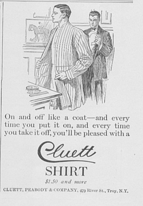
Very early on, a small (3 X 4 inch), black-and-white ad for Cluett Shirts ran in August 1908. Cluett begat the Arrow Collars and Arrow Shirts companies, and J.C. Leyendecker – championed by many, including Richard Martin (1995), Curator of the Costume Institute at the Metropolitan Museum of Art and Adjunct Professor of Art History and Archaeology at Columbia University, as a pioneer who introduced homoerotic imagery to American advertising – is believed to be the artist of this ad.
The advertisement shows two men disrobing at the end of the night, one standing behind the other in front of a dressing table where a comb and brush are set. The wainscoting and equestrian artwork on the wall leave some question as to the specific room in which the action is occurring. But there’s absolutely no question that the man in the foreground is removing his shirt as the man behind him takes off his own shirt collar. “On and off like a coat—and every time you put it on, and every time you take it off, you’ll be pleased with a Cluett Shirt,” says the copy. Many readers no doubt scanned the magazine’s pages and skimmed its contents, oblivious to the deeper implications of what the ad was showing and they might have been seeing. Nonetheless, there’s little doubt about what’s going on here … even if the exact extent of the relationship between these two men remains somewhat uncertain.
Another intriguing situational study is seen in a full-color 1923 Standard Plumbing Fixtures ad showing two men together, one ready for a shower or bed – the bathroom behind him – but, first, getting a light for his cigarette from another man with whom he obviously lives. The second man is sitting on a chair in an ante-chamber, perhaps a dressing or sitting room between the bedroom and bath. Other than the “Standard” brand name with a corporate name and address below, not a single word is given – or needed – to spell out what’s happening here.
Edward H. Sewell (2005) points out that homosexual references in the early 1900s were a coded affair in New York’s gay underground, with red ties symbolizing homosexuality and requests to light a cigarette a subtle way to initiate (intimate) contact between men. As the younger man wearing a red bathrobe bends over and leans toward the older gentleman seated in a comfortable chair and reading a newspaper in his dressing gown, a match is held out to ignite the standing man’s cigarette. The warm colors and arched doorway are carefully lighted to communicate a spirit of calm, cozy comfort in this relaxing, romantic setting.
Ladies and Lesbians?
Swains may outnumber the swans in American same-sex oriented ads, yet women who prefer the company of other women have had their fair share of being goosed and gandered by Madison Avenue over the years.
A lovely charcoal rendering of two beautiful women nestled in bed together graces more than half the page of Palmolive Soap’s 1915 full-page ad whose subhead states that it “Appeals to Dainty Women.” Dressed in frilly peignoirs and negligees, the two women shown have delicate features and long, flowing tresses or stylish, bobbed hair. They’re sitting in bed close to each other — one has her hands around her knees while the other’s legs are crossed and hang over the edge of the bed — as the lady on the left reads, perhaps a letter or a sonnet, to her rapt confidante. From the homespun linens and canopy over the bed to the gentle sensuality of the women’s looks and repose, the image exudes softness. Maybe it wasn’t uncommon back then for the gentler sex to spend nights together so intimately … but, then again, neither was it that unusual for young women to experiment with same-sex attractions before “settling down.”
It’s highly unlikely the intent of a 1939 Karpen Pil-O-Rest Mattress ad was gay on any level of understanding, but it is interesting to note that two women are shown running on a beach while holding hands. The headline announces: “They must have slept on a Karpen Pil-O-Rest Mattress!” Which means they’ve slept together in the same bed. This practice wasn’t particularly uncommon in its time; but it sure gave the girls in the ad something to smile about.
Nor do we know quite what to make of the two glam gals who grace a 1941 ad for Munsingwear Nightwear “that makes a girl feel mmmmmm all over … like Sunday morning in bed.” Delicately drawn by illustrator Gilbert Bundy in pen and ink, and overlaid with a watercolor wash in shades of red, these two temptresses are both graceful and downright sexy. What might they have planned for their evening? That may depend on whether the setting here is a boudoir, brothel, or someplace in between. Are they primping and fussing for each other … or are they expecting some late-night company? Wearing pajamas and high heels, the blonde seductively reclines in a chaise lounge while the brunette, in a swirling negligee with plunging neckline, stands and admires herself in a hand-held mirror. “Nighties beautiful to dance in; pajamas with that born-to-the purple swish of crackerjack styling,” crisply crackles the copy.
Again, can the two women in a full-page Pacific Pajamas ad from 1949 be assumed lesbians? They’re modeling pajamas for each other and the one on the right is contemplating her friend rather oddly with a “let’s see” look. The “Stop the Musing!” headline, along with such copy as “the trick is in the pic, pardner” and “West meets East with Pacific’s gay and exclusive ‘Desert in Bloom’ pattern” can be taken at face value … or stretched for added meaning.
Carl Erickson (1891-1958), a leading fashion and advertising artist especially well known for his work with Vogue and Coty cosmetics, designed a 1928 ad for The Rayon Institute of America to promote its new fabric. “Rayon fabrics are the fabrics of the heart,” murmurs the words in this art deco style ad, with the artwork gracefully complimenting the copy: Laying on a bed, head propped up by her right hand, a lady is lullabied by her companion who sits beside her at the edge of the bed, strumming a serenade on her guitar. Most probably a “flapper,” this new 1920’s woman smoked, danced and voted; she cut her hair, wore make-up, and went to petting-parties where shocking changes in the traditional moral code for women were trespassed.
Bathrooms and Bedrooms
Though they both appear to be roughly the same age, one man affectionately says to the other, “Be out in a couple of minutes, old man—just going to take a shower,” in an early 1920’s ad for Speakman Showers. Both men are wearing pajamas, slippers and bathrobes, implying that they’ve slept under the same roof. By the language used in this ad, however, it doesn’t follow that the men are necessarily related: “But if he had said: ‘I’m going to take a bath,’ that would have meant that the other fellow, unless he had considerable time to wait, would have gone to the office bathless.” Ideally controlled by the company’s Mixometer, the ad states that Speakman specialized in showers for residences, institutions, clubs, YMCA’s and hotels.
Topkis Athletic Underwear took a different turn from its traditional approach in a 1920 ad published in The American Magazine. Rather than a half-page, black-and-white ad as the brand had hitherto used, this advertisement was both full-page and full-color. What’s more, the two men in this ad are actually interacting in a bedroom rather than just sitting or standing somewhere and sizing up each other. The guys are getting up in the morning. There’s a casual air of insouciance about their morning rituals, with nothing unusual or different about this daily dressing routine, we assume, than any in their lives together. Already showered and in the process of dressing, one man stands in front of a dresser and mirror wearing his pure white Topkis union suit. Bare legs showing beneath a lilac bathrobe, his resident companion is sitting and commenting on his new spotless skivvies. Marveling about their low price, the underwear’s features are extolled in the copy: “Cut along loose, generous lines, Topkis underwear has little body contact, yet it does not bag or bulk. Free play for arms and legs supplies the needed spur in withering weather.” Heaven knows, most men do need that extra spur in withering weather … especially when it’s morning and there’s little body contact to begin with!
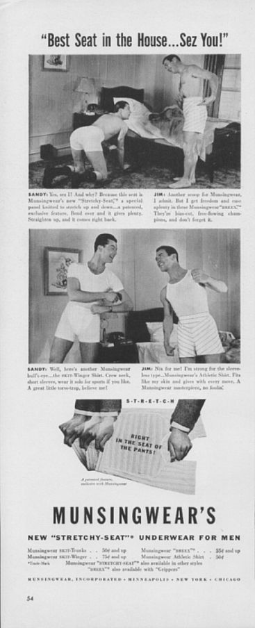
In 1942, Munsingwear, another men’s undergarment company, introduced “Sandy” and “Jim,” two half-naked men searching for something under their rumpled bed. “Best Seat in the House … Sez You!” announces the ad, to which Sandy confirms, “Yes, sez I!” Turns out he’s wearing the new “Stretchy-Seat,” an exclusive and patented feature: “Bend over and it gives plenty. Straighten up, and it comes right back.” Sandy is happy to demonstrate by kneeling down and bending over, buttocks in the air, in front of the unmade bed as if he’s about to do some push-ups. Jim, who looks as though he’s about to peel off his oddly striped boxers, stands in front of Sandy and retorts in defense of his own Munsingwears: “They’re bias-cut, free-flowing champions, and don’t forget it.” While Sandy and Jim may be different in terms of their underwear preferences – Sandy favors a crew neck, short-sleeved undershirt which he calls a “great little torso-trap,” while Jim is the sleeveless type of guy who goes for an athletic shirt that “fits like my skin and gives with every move” – they’re happy in their living arrangements. Notice that the bed is a full-size or double, not bunk beds or twin and that it’s obviously been used recently, presumably by these two attractive men.
Wink-wink went Munsingwear’s ads throughout the 1940s, deliberately cranking up the bawdy and risqué with humorous headlines, bedroom banter, and photos of men in close quarters cracking jokes about their naked cover-ups. Half-dressed, bare-chested men taking liberties in these ads made asses out of themselves – literally and figuratively – in and out of their underwear. A brief (pardon the pun) sampling: In “O.K., It Stretches! … So What!” a pillow fight in the bedroom quickly leads to a swat on the butt. “Just a Two-Timer, Eh?” progresses into “That’s Covering the End Zone!” in which a three-some massage turns into a heated exchange. “It Ain’t You That’s Well-Knit, Muscles!” quips a headline, as two home-grown acrobats clown around and show off their stuff – then lay down in bed – all with the greatest of ease. More locker room eye-locking takes place in “So You’re an Under-Cover Man!” where the guys are undressing and suiting up to hit some tennis balls. Was “under-cover man” a euphemism for “in the closet” back then?
In 1942, Reliance Universal published an ad for its pajamas. Featuring two fellows each wearing pairs of striped PJs — one seated and reading a newspaper, the other standing with an alarm clock in his hand — a casual observer could conclude that they’re brothers or friends who live together. But something is amiss with that scenario: The way they’re looking at each other, for instance, presupposes a sensuous joy and intimacy in each other’s presence. Their smiles … eye contact … tilt of the head … easiness of posture … go beyond a brotherly relationship and resonate with romantic residues. Moreover, in an affectionate gesture, the seated man’s slippered foot seems to be touching the other man’s leg just below his knee. Issued during the World War II years, the text complements and picks up on the ad’s “Rely on Reliance” headline: “Better sleep means better work, on any job! That’s why millions turn to the soft, restful comfort of Reliance Universal Nite-Tog and Rest-Rite pajamas between shifts, to return to the job refreshed and ready for action.” Whatever their “job,” the companions pictured here are both relaxed and appear ready for some action!
Bed and Breakfast Double-Entendres
Some “gay-vague” or “gay-ambiguous” advertisements are especially whimsical when their potential for double-entendre becomes a factor. A 1945 full-color Good Year Airfoam mattresses ad is headlined “Even a Steak Wouldn’t Get Me Up!” Head resting on a nicely plumped pillow, a distinguished-looking older gentleman is pictured in pajamas, comfortably ensconced under the sheet and blanket covering his cabin cruiser’s bunk. Facing him is a virile, younger man balancing a plate with a stack of pancakes on the fingertips of his right hand and a steaming pot of coffee in his left. Both men are smiling at each other. From the copy, we conclude that the elder gent’s Airfoam mattress is so comfortable that – forget the flapjacks! – even a succulent steak couldn’t convince him to abandon his bed. Yet there’s that subtle nuance of sexuality here, especially since we don’t quite know the relationship between the two men or why they’re together in such an intimate, domestic setting. “Get me up?” As in out of bed, yes … but also as in helping him to achieve an erection? Depending on the cut of the meat, it’s definitely worth a thought and certainly not out of the question.
“All you want in your dream kitchen is here!” exclaimed a 1952 full-page, full-color ad for Youngstown Kitchen. What’s in this room, though, are men cooking and cleaning and tripping gaily through their bright kitchen filled with white, mid-century modern Youngstown cabinets and linoleum floors. Wearing aprons and chef hats over their shirts and ties with nice slacks and highly polished shoes, the guys maintain an immaculate yet festive area in which to cook and eat. There are fresh flowers on display, along with ferns and knick-knacks set atop the wall cabinets, and bright yellow Formica countertops above the base cabinets. So what if these guys look a bit on the nerdy side? Their spic-and-span home would make any housewife desperate and jealous!
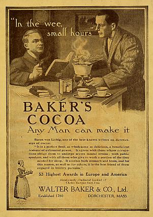
Before leaving the kitchen, let’s visit two more men shown together under the headline “In the wee, small hours.” The 1911 sepia-tone ad is for Baker’s Cocoa .
“Any Man can make it,” says the subhead. While we have no idea whether the “wee hours” here are by dawn’s early light or in the middle of the night, what we do know is that two men wearing bathrobes are alone at a table enjoying a brief respite before the rest of the world intrudes on their solace. Two cups and saucers, a few books, and the box of Baker’s Cocoa are on the table. As steam rises from the cocoa pot, smoke swirls out of the cigar the seated gent is enjoying while reading a book. The men interrupt their reverie and make eye contact … knowing that, for them and others like them, any man indeed can make it!
The More, the Merrier?
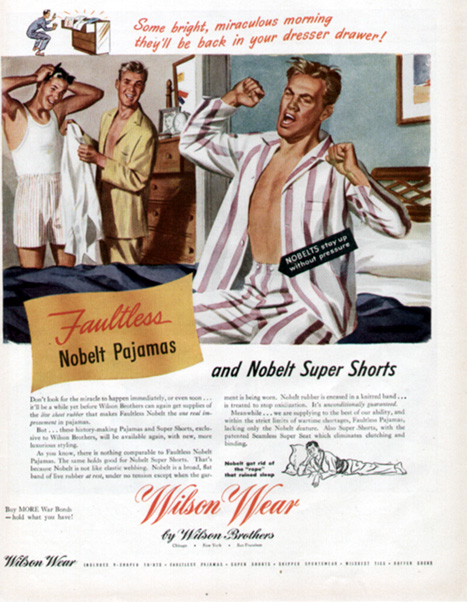
Finally, here’s a novel twist on those close encounters of the third kind … where a couple may actually have been a three-some: A 1945 full-page, full-color ad for Wilson Wear presents three men in a bedroom after a pajama party of some sort. Still in bed, one man stretches and yawns, his pajama top unbuttoned and open. In the foreground, two other guys appear as crisp and fresh as tomorrow’s Twinkies. One, dressed in boxer shorts and a T-shirt is combing his hair, evidently having just stepped out of the shower. His “friend” standing next to him hasn’t taken his PJ’s off yet but has selected the shirt he plans to wear. The Wilson Wear ad for “Faultless Nobelt Pajamas” is crowned by a headline whose cursive lettering and lilting pitch could have come straight from the Sound of Music: “Some bright, miraculous morning … they’ll be back in your dresser drawer!”
From sharing dresser drawers and bunks in the bedroom to cooking up a storm together in the kitchen, men and women in these classic advertisements can be seen throughout the house in various stages of dress and duress. On land or afloat, they’re engaged in domestic duties and feathering their nests while watching each other stay in ship-shape … or doing flip-flops over the sponsor’s product in the details.
References
Martin, Richard (1995). The Gay Blades: Homoerotic Content in J.C. Leyendecker’s Gillette Advertising Images. Journal of American Culture, Volume 18, Summer 1995, 75-82.
Attribute it, perhaps, to the Great Depression and/or the coattails of the Motion Picture Code (Hays Code) of 1930, whose “Particular Applications” specifically restricted references to “sex perversion” (i.e., homosexuality) … but advertisements of the 1930s were relatively nondescript and anemic—especially in terms of sexually ambiguous imagery and homoerotic double entendres.
It wasn’t until the nation began to crank up for war in the 1940s that a renaissance in same-sex subliminal seduction resolutely appeared on the pages of America’s mainstream media.
World War II brought men and women from around the globe together in close proximity. Gays, lesbians, and bisexual people could encounter others like themselves … though, of course, it wasn’t acceptable to express one’s sexuality openly.
Nonetheless, a number of advertisements from these war years featured soldiers in all-male environments either enjoying ribald and racy recreation or engaged in some sort of unseemly activity that, today, causes one’s eyebrows to arch in amazement.
The Cannon Towel Collection
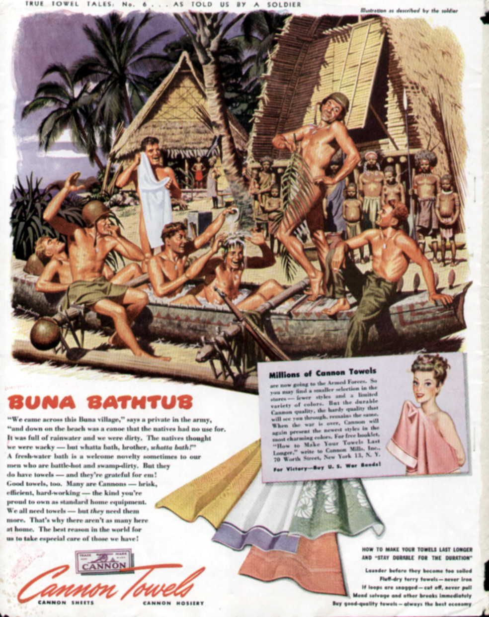
Fieldcrest Cannon Corporation, for example, ran a series of six “True Towel Tales” ads between 1943 and 1944 in several general-interest magazines. Showing soldiers bathing in the field and frolicking in a variety of licentious settings, the sequences showcase men engaged in what looks more like bawdy Boy Scout adventures than a weary and worrisome war. This homoerotic campaign of playful, naked men may be the inspiration for more recent beefcake advertising such as that produced for Calvin Klein and Abercrombie & Fitch.
Lest these ads be misrepresented, let’s go on record here and now by noting that these charming vignettes about life in the armed forces were unequivocally patriotic and domestically informative. Readers were reminded of the reasons they might not be able to find Cannon towels in their hometown shops — because “our boys in the service need them more than we do, so there are fewer to go around” — and given tips on how to make their towels last longer and stay “durable for the duration.”
Cannon produced advertisements honoring various branches of military service: the Army, Air Force, Marines, Tank Corps, and Navy. Supposedly, the story told in each ad is based on the actual recollections of a specified serviceman.
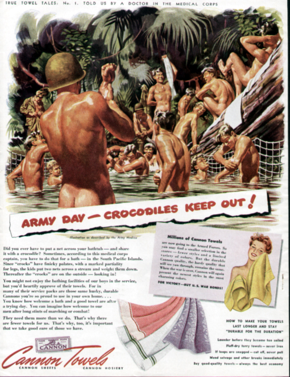
Accompanied by an illustration as described by an Army medic, “Army Day—Crocodiles Keep Out!”, Cannon’s True Towel Tales No. 1 (1943), is attributed to a doctor in the medical corps. Did you ever have to put a net across your bathtub—and share it with a crocodile? These naked soldiers might be smiling and having fun in the water but, according to their captain, sometimes you have to do that for a “bath” in the South Pacific Islands! “You might not enjoy the bathing facilities of our boys in the service,” says Cannon, “but you’d heartily approve of their towels.”
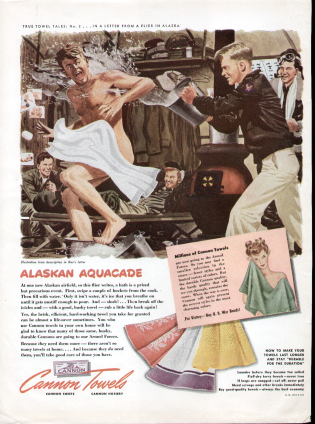
A half-naked airman is the subject of 1943’s “Alaskan Aquacade,” whose story was told in a letter from a flier. Chased around by a smiling buddy who throws water at him from a bucket, the surprised Air Force pilot is literally showered. A couple of grinning guys lounge nearby on the floor, under a rack of hanging uniforms. “At one new Alaskan airfield,” recounts the flier, “a bath is a prized but precarious event. First, swipe a couple of buckets from the cook. Then fill with water. Only it isn’t water, it’s ice that you breathe on until it gets unstiff enough to pour. And—slosh! … Then break off the icicles and — with a good, husky towel — rub a little life back again!” According to Cannon, the point is that “the brisk, hard-working towel you take for granted can be almost a life-saver sometimes.” Especially when dealing with an “agent” that’s too stiff for comfort!
Marines are featured in the third True Towels tale. In “…What? … No Bath Salts? …” (1943) even the illustration is based on a photograph supplied by the U.S. Marine Corps. Here the action takes place in the Solomon Islands, where “it’s either the Pacific with a shark to tickle his pinkies—or the water-tank.” When you’re “jungle-dirty” — as are these fighting men who take a break from battle to towel off and admire their handiwork — “the primitive water-tank’s a luxury,” claim our returned Marine heroes. Fortunately, where towels are concerned, the bath isn’t that primitive because the “brisk, efficient (Cannon) towels you take for granted are welcome equipment to our men in all the services.” Yep, welcome “equipment.” Towels!
Showing members of a U.S. Tank Corps in North Africa taking a nude swim and sunbath while a soldier poses playing Julius Caesar, Cannon’s 1944 True Towel Tales #4 is based on an experience told by a sergeant in the Tank Corps. Maybe the Roman bath was built for a conquering Caesar but in this advertisement it’s being used by “Joe Doughboy,” who’s enjoying a Roman holiday. The holiday includes lots of men doing their best to “camp it up.” When what ails you is the “Mediterranean heat and fight fatigue and pestering flies, a swim is welcome,” counsels Cannon. Welcome, too, of course, is the brisk rub-down with a good towel from the good-towel company.
Now imagine yourself in boxer shorts, taking a bath with an elephant. That’s the scenario in “Hey, Turn Off the Water, Jumbo!” Cannon’s True Towel Tales No. 5. As told by a soldier, this 1944 ad shows Americans in Ceylon where an elephant hoses down the sailors with its trunk as natives wash the pachyderms. According to the story, “…there’s a Hindu who lives near a river and owns an elephant. When the hot season comes, he’ll send our shore-going sailors a shower-bath for less than a rupee.” Of course, one has to bring his own towel! Does the image of being hosed off by an elephant seem exciting … or appealing and tawdry? “Me and my mates tried it,” sez the Sailor, “and ‘twasn’t bad!” It’s different strokes for different folks as this ad goes to show that not everyone is comfortable with a jumbo hose, mate.
Fieldcrest Cannon’s final True Towels Tale (#6) was also published in 1944 and deals, again, with our Army men. This time they’re center sage in an abandoned canoe, taking a nude bath while the natives form an audience. As the villagers look on, a soldier playfully poses and vamps with a palm branch barely covering his body. Is this a bath … the “baths” … or a drag show? The canoe was full of rain water “and we were dirty,” explains the soldier. “The natives thought we were whacky—but whatta bath, brother, whatta bath!” Like the other ads in Cannon’s campaign, the men here seem to enjoy looking at each other’s nude bodies. This ad in particular seems to focus on a man pretending to be in drag, entertaining the men — some sitting between each other’s legs. One soldier looks on and whistles as, puzzled, the natives watch from afar.
Cannon’s strategy was an effective way to propagandize people to support the war effort, and provided some appealing eye-candy for women and the boys. Despite what could be construed as racist images of “natives” looking on as the military men bathe, the message is clear: Our GIs are having a good time, keeping clean, and out of harm’s way.
“The focus of these ads was on the value of Cannon towels to the soldiers, but the images were homo-erotic enough to allow for an alternate interpretation by a gay man,” says Edward H. Sewell (2005).
Bear in mind that on the battlefield, as in other gender-specific environments (i.e., same-sex boarding schools or jails), the absence of women could possibly have allowed for a more liberal and freer expression of man’s primal needs … and that, given the circumstances, society generally may have been more willing to waive its condescension or condemnation of such activities.
Don’t Ask, Don’t Tell?
“The war years had witnessed a sudden and dramatic change in the appearance of men in Life magazine,” writes John Ibson (2002) in Picturing Men: A Century of Male Relationships in Everyday American Photography. “Men in various postures of intimacy had begun to appear in Life advertisements with remarkable frequency once the war was under way. In several issues just before the conflict, in 1940, the magazine had depicted no adult men alone together, without women; by 1943 and 1944, only one issue had no such male-to-male interactions in advertising.”
The potent mix of masculinity and patriotism symbolized by soldiers and sailors has, in its biochemistry, fundamental elements of seminal appeal. So, Cannon wasn’t the only company to employ homoerotic images in its advertising.
Nor was Cannon the only towel company to promote its products with advertisements featuring naked men engaged in activities, like doing laundry, associated with the gentler sex. A stunning illustration in a 1942 ad for the Pepperell Manufacturing Company of Boston shows the “U.S. Hand Laundry” corps in various stages of undress, cleaning their clothes in a river. With no washing machines or buttons to press, the muscular graphics undoubtedly drew admiration from men, as well as the attention of women.
Sacrificial Soldiers
Although a sense of free-spirited debauchery may be distilled from ads sponsored by Coca Cola, Pullman, Fisher (GM) Body Works, Armstrong Cork, Oldsmobile, Interwoven Socks, Listerine, International Harvester, and even Ma Bell, patriotism, sacrifice, and the welfare of our troops are all prioritized in these World War II ads … whatever else can be inferred or implied.
Perhaps no other ad so succinctly represents this primordial tug-of-war between protecting our boys and allowing the men their sexual latitude in such critical times as “The Kid in Upper 4” sponsored by the New Haven Railroad and published between 1942 and 1943. Immortalized by social historian Allan Berube (1990) in his definitive book on homosexuality in World War II, this ad has special significance: “Life in sex-segregated quarters created homosexual tensions as well as opportunities,” Berube contends. “A magazine advertisement illustrates how young recruits were placed ‘two in every lower berth’ on troop trains.” Presumably, the kid in upper 4 is depicted alone, worried, and wide awake because he is so young, so angelic, so blond. Poignant text about him leaving home and heading to war talks about what he left behind and what faces him ahead: “Next time you are on the train, remember the kid in Upper 4. If you have to stand enroute—it is so he may have a seat. If you have to wait for a seat in the diner—it is so he … and thousands like him … may have a meal they won’t forget in the days to come.”
What a tearjerker! A gay man’s eyes moist over this ad even today, thinking about what may befall this beautiful boy in the upper berth once he arrives “over there.”
Madcap Male-to-Male Interactions among Military Men
Madison Avenue’s woofish sketches of warfare revolved around sweat-drenched soldiers surrounded by other fighting men (and, at times, natives) who are either smiling and sneering or leering and jeering as they hand off erectile projectiles — artillery, missiles, guns, cannons or swords — to their comrades and/or combatants in arms.
The men here may not have been alone in the trenches, but their demeanor — sometimes saucy, other times threatening — and the winsome wording of the ad copy could coalesce to produce a sexually provocative response from some men in the advertising audience. Bombastic, iconoclastic … and homoerotic … are words that would agree with these sabers-rattling ads.
A 1943 full-color ad by Fisher, then a division of General Motors, is headlined “Body blow by Fisher.” Certainly the possibility exists for some double-entendre, especially as augmented by other ad copy here: “Take care of that equipment … make it last … make it do.” Beneath a blazing sky, this full-color advertisement shows a number of shirtless soldiers blowing off rigid cannons being both loaded and discharged.
That same year (1943), the National Dairy Products Corporation and Affiliated Companies issued its own call to arms with a smiling, jungle-based soldier “spoon-feeding” a hunk of cheese into the mouth of a cool, calm and collected military man from the Alaskan snows with a large firearm firmly balanced behind his bowls. “When guns are hot and time is short, the emergency cheese ration can be eaten as it is—like a candy bar,” carps the copy. “Or it can be mixed with a little water to make a tasty spread for bread. Or the mixture can be set aside for an hour or so and then sliced.” Sliced, spread or diced, America’s fighting men could cool their guns with (purportedly) tasty treats … even during emergencies!
Soldiers, some undressed and others in various stages of uniform, are also featured around a cannon that’s just shot a load in a full-color 1943 ad for Inter Woven Socks. Nothing’s really outlandish here, although a queer eye looking beyond the (presumably) straight soldier guys will probably laugh at the headline: “In Times Like These—Endurance Counts.” While the socks may indeed be “Long Wearing … Comfortable … Good-Looking,” it would be most extraordinary if the battle-weary soldiers were wearing such lovely argyle, striped and solid color socks under their regulation boots and regalia.
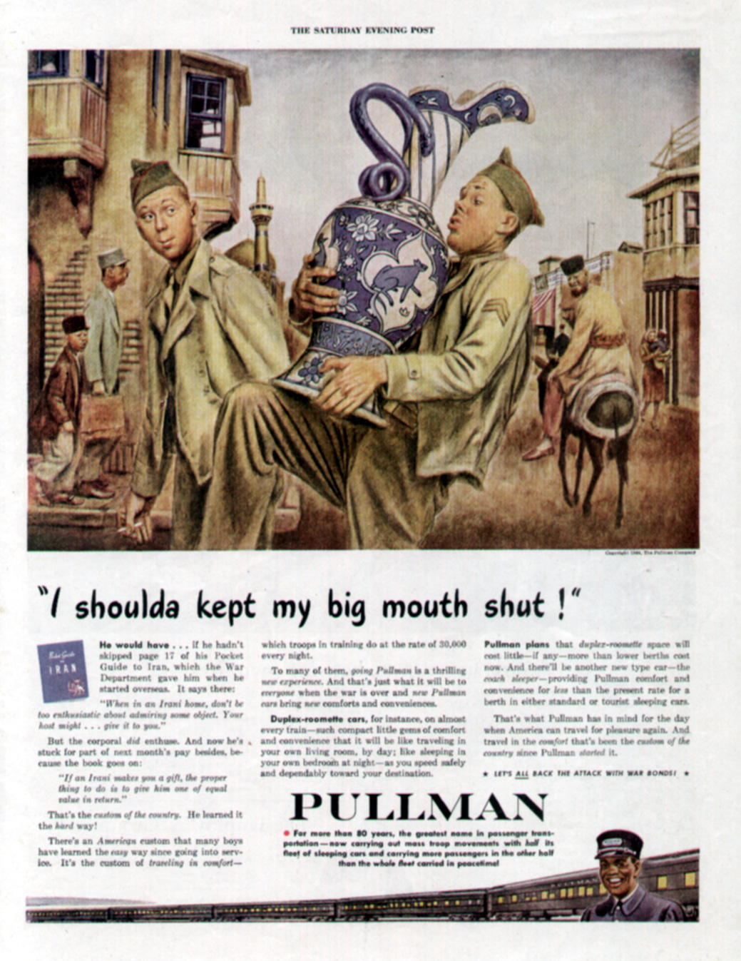
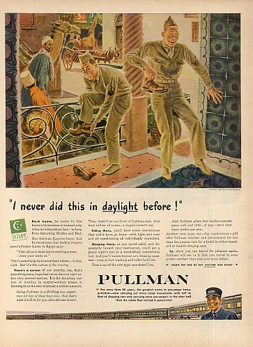
Pullman produced several ads in a series illustrated by Albert Dorne during 1944, when their passenger trains carried troops instead of people traveling for pleasure. In one, two soldiers stationed in Egypt are trying to adapt to a particular custom of the country: taking one’s shoes off before entering a home. But until we’re well into reading the copy, we don’t know that. Instead, as a native looks on suspiciously, two GIs guiltily remove their footwear in the threshold of a building. The ad’s headline — “I never did this in daylight before!” — adds to the illicit sense that the soldiers have been caught doing something for which they can be discharged today. “Back home, he came in the house with his shoes in his hand only when he’d stayed out late — to keep from disturbing Mother and Dad,” begins the copy. The implication? Possibly this: He might have been a good boy back home, but now he’s indulging his baser instincts.
A large piece of artillery from a crate of ammo in hand, another shirtless soldier with a somewhat skeptical but determined look approaches a uniformed GI in a jungle somewhere during the war. As he brandishes the burnished shell at his comrade, the headline in an Armstrong Cork company advertisement screams: “Listen, soldier, it just doesn’t make sense!” Is the shirtless soldier menacing the other man, who’s attempting to talk him out of doing something unwarranted or outlandish?
Attempting to gain a sense and semblance of the action here, our eyes wander around the illustration. There’s another soldier smack in the middle, watching what’s going on with obvious delight. Behind him, almost hidden by the trees and foliage, other men stand in front of a cannon or, bare-chested, carry duffle bags above their heads.
Let’s now turn to the advertising copy here and read a conversation between Bill, Joe and Hank. As it turns out, Bill is simply showing the shell to Joe so he can see the Armstrong trademark. Joe, whose father has been selling Armstrong Linoleum in his furniture store, can’t believe the same company manufactures weapons. It’s Hank — the smiling soldier ambling up to them — who explains that the Armstrong companies make a lot of different products.
The graphics and headline of this attention-grabbing ad don’t come across as appropriate for a mild-mannered exposition on the “hundreds of diversified products” made by Armstrong. But that’s how an effective advertisement can work. Shock value grabs our attention as we sort out the pieces, seeking solution(s) to the advertisement’s purpose or message. Appealing to our sense of fear — homophobia … a jungle setting … in the midst of a world war — this homoerotic ad uses language and images to create a complex yet compelling tableau.
Close-knit sailors — perhaps a bit too close for comfort — appear in a 1945 advertisement for Listerine Antiseptic, touted here as “the tested treatment” for infectious dandruff. “Oh, yeah! A month’s pay says it will!” bets the sailor on the right, referring to Listerine’s ability to get rid of the flakes and scales on his buddy’s jumper. Head cocked aggressively with his face uplifted and an expression of bully daring about him, the sailor holds out some money in his left hand while his companion brushes the dandruff off his shoulder. Chastised and chastened, chagrin is etched deeply across the downcast face and furrowed brow of the embarrassed sailor who’s ashamed to look his friend in the eye. Although hardly effeminate, there’s something soft and feminine about the suffering soldier. Here’s a twist, a role reversal from most (non-combat) advertisements of the time that show a man and woman — where she always tends to be the student to him as the teacher. One guy learns an important lesson about personal hygiene from another in this ad. How domestic and degrading for a military man!
Listerine had laid on a lulu of gay ambiguity in an earlier, 1943, ad: By their body language, two bruising sailors appear to be doing some sort of cheerleading or mating minuet as they bend and bow in a bizarre ballet, looking cautiously at each other. “Butch says don’t bring Lulu,” one tells the other in this 1943 ad for Listerine. Leaning close, the sailor seems to be winking wonkshly while his buddy nervously looks around to see if they’ve been caught or observed together. Turns out that little things disturb courageous men like these: “Butch came through a couple of bombings and never batted an eye,” we learn. But when it came to a second date with Lulu, “he wanted out.” Sure, Lulu was a looker – with good “gams, and plenty of oomph.” When shore leave is short, though, a man doesn’t want to spend it with a girl who’s got bad breath. Listerine may have been part of their “passport to popularity,” but our money is still betting on Butch and his flag-waving buddy … leaving Lulu behind.
Epilogue
After the war, titillating ads continued to appear with potentially hidden, coded, or ambiguous gay themes and messages.
“Monogamy at the Naval Academy: Now A Forced-Feeding Social Life,” proclaimed an ad promoting an upcoming story to be published in the March 1, 1958 issue of The Saturday Evening Post. But to what kind of monogamous social life … and whose forced feeding … did the headline allude?
With 1,700 rooms and five miles of corridors, Bancroft Hall — “one of the largest single dormitories in the U.S.” — houses the Naval Academy’s entire brigade of 4,000 midshipmen, states Blaine Taylor (2005) in Military Heritage magazine. Since Annapolis first accepted women as midshipmen in 1976, the purported lack of monogamy and potential erotic overtures among the men housed there tug at the intellect but boggle the mind.
“What will it take for a straight guy to go gay?” asks Kevin Cassell (2004). “Try just a few weeks in the United States Navy during a time when homosexuality was not just grounds for dishonorable discharge, but for a full-scale criminal investigation and, if found guilty, incarceration. Yes, it happened: dozens of young, straight naval recruits ‘went gay,’ with no small degree of enthusiasm, at the Newport Naval Training Station in Rhode Island in 1919.”
Not a well-known fact, shares a friend, but “in the early 1950s, during the height of the Korean War, the military academies were being forced to turn out more officers than they had the capacity to house. Since most of the bunk beds were being shipped out to military barracks, the academies had to resort to double beds in their small rooms, and putting three cadets into a room with two in a double bed. This didn’t last very long when it was found out that the double beds facilitated some ‘buddy activity’ during the night when the bunkmates got familiar with each other. I don’t recall where I first learned this, and I’d certainly go look for a definitive reference before repeating it, but I’m 99% sure it’s true,” he said.
Despite McCarthyism and the myriad struggles predating Stonewall yet ahead, “gay” and homoerotic imagery — explicit or implied — made such headway during the World War II years that the roadblocks to real liberation throughout the advertising world would become fewer and farther between.
But that’s the grist for another article … or, more likely, a series.
Retired communications professor, marketing director, and publisher Bruce H. Joffe has amassed an extensive array of media, management, and human resource experience, along with counseling and “people” skills. Fluent in Spanish and conversant in Portuguese, he has taught public relations, media, marketing, and journalism courses at The American University, George Mason University, Mary Baldwin University, Carthage College, and Kaplan College. The award-winning author of magazine features, academic research, professional journal articles, and newspaper byliners, he has published eight books: titles deal with marketing, the media, interfaith and progressive theology, church reform, gender studies, and international (intercultural) living/communication.
Processing…
Success! You're on the list.
Whoops! There was an error and we couldn't process your subscription. Please reload the page and try again.
Vintage American Underwear Ads Feature Sexual Innuendo between ‘Boys’ in the Brands
“Over the years, underwear has been associated with modesty — or with the lack of it,” points out Vintageskivvies.com. “Underclothes are inextricably associated with morality, sensuousness, cleanliness, sexuality, hygiene and — sometimes — even social status,” claims the underwear retailer on the archival pages of its Web site: http://www.vintageskivvies.com/pages/archives/history/thetwentiethcentury.html.
The online retailer has a twist: In addition to its virtual store selling products with a sizing chart and posting its sales/return/shipping policies, along with a clickable list of brick-and-mortar underwear retailers, vintageskivvies.com features an archives section with articles, blogs, a glossary, history, and ad gallery all about underwear. It’s the world’s first e-museum to focus on what men have worn under their trousers.
According to Vintageskivvies, undergarments “have had — and still have — important ‘psychological’ characteristics. To understand this aspect of what we wear nearest to our skin, we have to view undergarments in the light of the epoch in which they were popular.”
It’s a complex topic, further complicated by the whims of fashion:
Then as now, advertising attempted to fulfill its raison d’etre by communicating the changes in underwear to consumers. But in the process, it succeeded in doing more: Explicit or implied, advertising incorporated homoerotic overtures, themes and subtexts within its messages. Take the saga of B.V.D., for instance.
A Better View Designed
Founded in 1876 by three businessmen — surnamed Bradley, Voorhees, and Day — B.V.D. was first known for its men’s “spiral bustle” with long sleeves and legs made of a heavy knitted fabric. In 1908, that bulky and tight-fitting garment was turned into a new, looser line of underwear. B.V.D. then added a two-piece number and the popular “union suit” to its offerings. With the ever-popular advertising slogan “Next to Myself I Like B.V.D. Best,” the company introduced a lightweight, waffle-like fabric, notes Esquire contributor John Berendt (1987).
Intrinsic to almost every B.V.D. ad produced between 1913 and 1926 is a pair of book-ended boys who seem to become increasingly involved with each other as their advertising adventures unfold.
“The Fag-Free ‘Fans’ Wear B.V.D.” (Figure 1) published in 1913 features a crowd of people illustrated in cartoon-like fashion. Headline and copy literally flow below the illustration to form a T-format layout with the two buddies in their B.V.D.s placed symmetrically in ovals aligning the copy as somewhat mirror images. Though obviously interested in each other, the B.V.D. boys are young, fresh and still relatively innocent. “Cool and comfortable despite the grueling heat, the fag-free ‘fans’ in the foreground wear Loose Fitting, Light Woven B.V.D. Coat Cut Undershirts and Knee Length Drawers, or Union Suits,” states the copy.
Following their fag-free outing, the buddies are back in 1914 with another ad that, again, fits them to a “T.” This time they appear cool, calm and collected below a bunch of chums struggling to enjoy their vacation from the stifling summer heat. “No Fun,” Says He, “Unless You Wear B.V.D.” It’s not precisely clear who the speaker is in the headline here, but, for argument’s sake, let’s assume it’s one of the smiling guys lifting the boat out of the water. If so, he’s facing the seated lad who’s uncomfortably wiping sweat off his brow, tie undone and hat on his knee, a duffle bag on the ground beside him. The plot thickens as we continue reading the copy: “Get the full fun out of your vacation in B.V.D. If you’re cool, work is play, and either side of the road is the shady side.” Either side of the road is the shady side? Could this possibly be construed as referring to men who like their sex both ways, with women … and with men? Probably not – at least not at the time; but it’s something today’s reader might consider.
The boys are joined by others seeking comfort at Camp B.V.D. in a 1915 ad. Though a line in the advertising copy – “It’s the Underwear of red-blooded, right-living men who find clean fun in keen sport” – conjures up images of fundamentalists denigrating what Arnold Schwarzenegger has called “girly-men,” taken as a whole cloth, this advertisement is both welcoming and inclusive. From a man in business attire to another wearing more casual dress (and, of course, the emblematic B.V.D. boys in their cool and comfortable socks, sneakers, and undergarments), the environment, as the clothing, “won’t bind or irritate.”
In other ads published during these years, the B.V.D. lads visit the movies, take a train ride, go cruising on an ocean liner, fish, play a game of shuffleboard, avoid the summer’s stifling heat … and just lounge around enjoying being together. The loose-fitting, light woven B.V.D. underwear teaches them the fine art of “Take-It-Easy,” as in a 1916 ad where they’re admiring each other while holiday travelers hustle and bustle about in an illustration above them. Wherever they are and whatever they’re doing, there’s one thing they both agree upon … the B.V.D. slogan: “Next to myself I like ‘B.V.D.’ best.” A bit conceited and self-serving? Perhaps. But, to B.V.D., they’re obviously worth the words and congenial compliment.
The graphic “T” layout returns in an 1917 ad in which the B.V.D. boys continue to enjoy each other’s company (at the bottom of the ad) while a baseball game is played above. Any question about the appropriateness of the appreciation the B.V.D. boys may share for each other is overshadowed by the ad’s striking athleticism, in which a batter and catcher face a crowd full of fans.
Recreation is also the theme of a 1917 ad where our buddies, crisp as cucumbers, relax in their underwear. Above them, a park filled with people swelter wearing parisols and hats. The boys, as always, are at their best “physically and mentally,” because their B.V.D.’s “cool, clean touch helps take your mind off the heat, as well as the heat off your body.” When you’re hot you’re hot; when you’re not, you’re not, n’est-ce pas?
Whatever the temperature might be outside (or in), the relationship between the B.V.D. boys has heated up by the time they appear in a 1919 ad. While still separated by the copy between them (below), their thoughts are on the two men pictured (above) who’d be too close for comfort in other circumstances or surroundings. Here, however, they’re quite at home … ready to turn in and spend the night together.
As World War I raged, a 1918 B.V.D. ad reminds us that “the comfort of the individual must come second to the need of the nation.” Back then, even government requirements urged all citizens to “please be tolerant,” since undergarments weren’t as freely available as previously. The consequences of such a shortage surely must have created a challenge, as well as untold possibilities. Even though the B.V.D. boys by now have been liberated from their chaperones, spectators and companions – they appear alone (without even a “double-date”) from this point on in B.V.D. ads – it’s comforting to know, especially given the circumstances, that their undergarments haven’t been sacrificed to the war efforts.
Somewhat older and a bit more mature in a 1920 ad (Figure 2), our buddies are seeing red as color is added to the B.V.D. advertisement. Perhaps it’s a registration problem with the printing press or process, but our protagonists appear to have rouge on their cheeks … and the man on the left has obvious traces of red lipstick on his mouth. Nobody overseeing their activities, the guys are in close proximity in front of a phonograph. One’s holding onto the Victrola, the other has a vinyl record in his right hand with his left hand resting atop a nearby chair. Smiling, both seem to be happy in their underwear—alone yet together. The man with darker hair (on the left) has his undershirt unbuttoned from top to bottom, although the buttons fastening his bottoms are completely closed. Is this a “pajama” (underwear) party? Are they preparing to spend another night together by setting the tone, tenor and treble for a possible paso doble? Clearly, they approve of the music selected. Is it time for an encore?
In this continuing B.V.D. soap opera whose storyline could track a progressive relationship between these two buddies, can a later (1921) ad showing them in the same underwear as the earlier (1920) ad be an allusion to the morning after? It looks like the one on the left is holding a note in his hand as his line of vision heads directly towards his partner’s crotch. What’s more, a small inset of his posterior may hint of another view they’ve shared together. His undershirt still unbuttoned, feet sheathed in slippers, one of the boys holds onto a bathrobe. Has he just taken it off … or is he about to put it on?
Two other 1920 advertisements for B.V.D. merit a mention. In both, the boys again are alone in their underwear.
In “Longwear,” the man on the left holds out what looks like a tennis ball, inches from his buddy’s lips. It’s a gesture reminiscent of Eve tempting Adam with an apple and one almost expects to hear that “the serpent beguiled me and I did eat.” Copy in this ad seems rather defensive or competitive, making the point that you get a lot for your money with the B.V.D. brand: “Materials of enduring strength and workmanship of scrupulous care make B.V.D. wear far beyond what it is fair to expect.”
The second 1920 ad, “Quality,” refers to it being a “tradition with its makers and a proverb with its wearers.” While it might be a proverb for other wearers, our boys here seem to be scanning the morning newspaper instead of reflecting on their Bibles.
Looking almost angelic and cherubic, the B.V.D. boys pose in front of a Christmas tree inside a home parlor in a 1924 ad. Despite any pretense about what they’ve been doing together, undressed except for their undies, they’re obviously comfortable and at ease. Though the headline copy reiterates the slogan, “Next to myself I like ‘B.V.D.’ best,” one has a sneaking suspicion that what (or who) each really likes best next to himself isn’t an undergarment—B.V.D.s or any other brand!
Modeling their starchly-pressed union suits, our own Betty (blond) and Veronica (brunette) are warned to “Look before you leap!” in a 1925 ad. To their right, sketchy cartoonish characters incautiously jump off a diving board onto the beach below. But they hold little interest for the B.V.D. boys, who are immaculately attuned to each other. The “‘Looking for the label’ after you’re sorry won’t change it to ‘B.V.D.’” subhead is a curious reminder during our current era of STDs, HIV and AIDS to use protection and practice safe sex rather than suffering the potential consequences later.
In 1926, the B.V.D. ads took on a new look with illustrator Walter Jardin. Artwork is sketchier, with less emphasis on the earlier style of portraiture or classical realism. The ads, here one-third instead of full-page, are smaller but contain almost the same wording and copy in their texts and headlines. To be sure, the type and font is similar … but the focus remains on both B.V.D. boys.
In one 1926 ad they’re in a park or forest, again spinning records and enjoying music. Flies, ants, bugs and bees don’t bother these two, even as dressed only in their underwear. “The test of underwear comfort is to be able to forget you have underwear on,” advises the ad copy. Somehow, one doesn’t think that’s an issue for these buddies in their B.V.D.s.
A second 1926 ad places the boys inside a house … maybe in a parlor, living room, or sitting room adjoining a bedroom. The men appear ready to call it a night and head off to bed, as a bathrobe is about to slip off one of their arms. “Every Time You Dress give yourself the delight of slipping into cool, fresh B.V.D.”! headlines the copy. Given the implications of the illustration, however, a slight variation might make for a more appropriate title and lead copy: “Every Time You Undress, give yourself the delight of slipping out of cool, fresh B.V.D.”!
Battles among the Brands
B.V.D. wasn’t the only brand courting the male underwear market in the 1920s. Other makers included Duofold, Hanes, Hatch, Madewell, Munsingwear, Navicloth, Superior Underwear, and Topkis. Unlike today’s sensual poster boy exhibitionists in their Calvin Kleins, underwear wasn’t always attire for the fashion-conscious male. Instead, men sought comfort and value from the clothing that came closest to their skin. And, maybe, a psychological pick-me-up from their advertising, too.
“All a man used to seek was some sort of underwear that would not bulge, bind, gap, chafe, or sag,” says vintageskivvies.com on http://www.vintageskivvies.com/pages/archives/history.html, “something that — when hung out to dry — would not attract enemy fire.”
“Oil paintings of men in their Kenosha Klosed Krotches by Saturday Evening Post artist J.C. Leyendecker were daring for 1911 and made history as the first national print ads for men’s underwear,” according to the web site, http://www.vintageskivvies.com/pages/archives/history/theteenyears.html. “Most of the [m]en [s]hown in early underwear advertisements were fellows who ‘Put hustle in the tussle!’ as the Superior Underwear Company put it, men who were likely to put a lot of ‘strain’ on their undergarments.”
A cute 1915 Wilson Bros. ad, for example (Figure 3), advances the company’s undergarments with two men in their Athletic Union Suits out on a dock of the bay casually shooting the breeze and smoking pipes. Neither appears to be embarrassed or self-conscious about doing something out of the ordinary as they chat and relax outside dressed only in their underwear. (A tall wooden wall does partially hide them from potential onlookers.) “Seat opening cut generously full for greatest convenience,” states the copy, neatly positioning one of the product’s prime benefits.
“Sold in a Cleaner Way” was the distinguishing characteristic of Sealpax Athletic Underwear for Men. Surrounded by admiring male fans in the bleachers, an athletic underwear champion jumps over the Cool and Clean sidelines holding honors in hand in a 1921 Sealpax ad loaded with homoerotic innuendo: “‘Boy, oh Boy,’ you appreciate Sealpax when you’re mixed up in a crowd, when it’s hot—and stuffy—and everybody ‘round you is sweltering. Sealpax keeps you cool as a cucumber. It’s that kind of underwear—built for man-sized comfort. Cool because the fine nainsook fabric is cool—comfortable because it is cut to follow the movements of your body—no chafe—no irritation—the coolest, finest underwear a man can slip into.” But the best thing about the underwear is the brand’s package: “Sealtex is better athletic underwear and it is sold in a cleaner way—packed in the individual Sealpax envelope which keeps it as fresh and clean as the day it was made and laundered.” Not unlike today’s prophylactics, that sanitary covering was salutary and undoubtedly appealed to health-conscious men.
That same year (1921), Hatch advertised its one button union suit with a two-thirds page black and white ad (Figure 4). Two pretty men standing very close to each other draw all eyes to their interaction. With an hourglass body, the one on the left has his right hand on his hip in a most unmanly manner. Meanwhile, the man on the right has his right hand on the other’s shoulder and his left touching the man’s chest. The way they’re drooling over each other as caught at this snapshot in time leaves little question about what’s on their minds and what they intend to do about it.
The Focus Shifts
As the industry turned the corner, making inroads through the 1920s, its emphasis began to shift towards convenience, comfort, and value. Perhaps no other company better synthesized these concepts in its market positioning as Topkis Athletic Underwear.
If B.V.D. had its boys preening and admiring each other as the company’s advertising developed, Topkis — whose very name conjures up a talisman capable of girding one’s loins — distinguished the different men pictured in each of its ads not as playful, peek-a-boo boys but more mature and fully functional men capable of carrying on life’s affairs and, perhaps even, a relationship with each other.
Moreover, B.V.D. may have been the market leader in men’s underwear back then but Topkis had its own marketing strategy and unique selling proposition: value. In fact, nearly all Topkis ads emphasized how much quality you got for just a dollar!
A young man formally dressed in a suit, white shirt and tie sits backwards on a chair ogling another youthful gentleman wearing only his underwear in a half-page, black-and-white Topkis ad published in 1921. Even though it’s only early fall, the headline warns, “Your skin must breathe in winter, too.” Mid-way through the copy, however, we find out that “The way to let your skin breathe properly is to wear the Topkis Athletic Union Suit all year ‘round.” Soon, the brand’s positioning statement appears: “It’s the biggest underwear value your dollar ever bought.” That being said, a rationale for the graphics still must be questioned: Why are two young men — one fully attired, the other only in his underwear — sitting that closely together and smiling so playfully at each other?
Unlike the iconic B.V.D. boys who appeared in each of the brand’s advertisements we’ve seen, different men participate in the action of Topkis.
Once again, a fully and formally clad gentleman is seated backwards on a chair and seriously contemplating a young man — this time standing with a brush in his right hand, his left hand ruffling through his hair — in a 1923 ad of the same size and graphics. The Topkis positioning statement is prominently articulated in the headline: “You can’t beat Topkis at double the price.” Advertising copy continues to belt home the fact that, regardless of the price, no athletic underwear beats Topkis for quality or value. Succinctly stated at the end of the ad: “Why should I pay more, when I can get Topkis for a dollar?” Copy is convincing and market-driven. But what’s the story of the two men in the picture? Why does it seem that one is standing in the footlights, “auditioning” for the other?
“Topkis is worth lots more than a dollar,” insists the headline of another Topkis ad, also published in 1923 (Figure 5). Evidently, the handsome man looking intently at the binoculars he’s holding — possibly a gift from the chap dressed to the nines in a sailor’s jacket, cuffed slacks, cap, white shirt, and bowtie who’s seated in front of a ship’s porthole — is worth lots more than a dollar, too. From the following copy, it’s obvious that the clothes-horse is used to paying the price for what he wants and that he’s used to having his way: “An athletic union suit has to be a good bit above the average to satisfy me,” he says. “It must fit me without either skimpiness or bagginess — the material must be of good quality — and I insist on long service.” We learn a bit more about him, too, in his following revelation: “I’ve been accustomed to paying fairly stiff prices to get the kind of underwear I want. But no more! Topkis gives me everything I could ask for—and at One Dollar!” Are the binoculars a gimmick or prop … or are they a bribe, a teasingly tempestuous toy that will figure more prominently into whatever may happen next between these two swains?
The beat goes on as another debonair young man, hat in hand, admires the virgin-white Topkis athletic underwear exposed when his cute friend removes his bathrobe. Unlike the previous ads, both men are standing here. This half-page ad, which ran in 1924, bears the headline: “Dollar Topkis worth more say the men who wear it.” Why, just ask any man who wears it and he’ll tell you “the way to be sure of getting the most for your money when you buy underwear is to look for the famous Topkis label.” Maybe that’s what the well-groomed dandy is looking at here: the Topkis label? But where, exactly, is that label? Following the gentleman’s line of vision, the label must be directly below the belly button, somewhere above the crack in the shorts!
Two months later, Topkis ran a half-page ad featuring two other men. A hunky stud in all-white undies begins to unbutton his athletic underwear in the April 1924 ad’s foreground, as a shorter and somewhat stoical cohort — maybe his butler or valet? — is standing nearby. Dressed in dark colors, he uses a brush to remove any lint from the jacket he’s holding. For some reason, the guy appears subservient and not too happy. Maybe it has something to do with the book on the bench between them with its pages open to a particular passage? Though the darker man’s face has turned in the direction of his client or patron, he stands with an arched back angled away from him. “One dollar — and a dollar never bought more value,” heralds the headline. Perhaps any acrimony (rightly or wrongly) perceived in the ad can be attributed to the following copy. “No good dealer asks more than One Dollar for Topkis. Many will tell you it’s worth more.”
And the Boys in the Brands Played on …
As the underwear battles continued throughout the 1920s, one maker’s attributes and the qualities that set it apart from another manufacturer’s jockeyed for market position. Whether it was Wilson’s, Hanes, B.V.D. or Topkis, the boys in the brands played on.
Hanes had the anti-squirm shorts with the seamless seat, but Topkis underwear boosted the roominess, allowing men to move in comfort: “Why, man, Topkis lets you forget you have underwear on! Fit? It sure does! Roomy, easy — never a hint of skimpiness anywhere,” claimed a company ad published in 1921. “In your most active hours or work or sport, as well as your moments of rest, Topkis gives your body full freedom. Seats open easily. Drawer legs don’t creep up.”
About a decade later, in a statement to fashion-conscious men of the time, an Arrow underwear ad (Figure 6) appearing in the Spring 1933 issue of Apparel Arts: Fabric & Fashions skirted the delicate line between being Gay … but not too gay: Two handsome jocks in a locker room (either dressing or undressing) evidently are pleased with the virtues of their underwear. “And now the Shorts with the Seamless Crotch go Gay! (BUT NOT TOO GAY),” we’re happy to learn from the headline, as the text’s message extols the “greatest contribution ever put in shorts—the seamless crotch.”
After all, who wouldn’t be glad to say goodbye forever to binding … bunching … climbing … and cutting? What’s more, Arrow now has taken its seamless crotch to new heights of haute couture by adding color “that makes men blush in the locker room,” according to the ad.
Homoerotic or Simply a ‘Gay’ Trompe L’Oeil?
Advertising is typically designed to convince us to buy a specific product or service, whether for the first time or by switching brands. In pursuit of consumers, themes such as vanity, vitality and pleasure are strategically communicated.
So, what can we conclude from these early years of underwear advertising … before gay-specific images became so prolific? That ads infused with same-sex imagery and intimacy simply stood out and caught the readers’ attention because they were oddly dramatic or hinted at homoerotic themes?
Or is it all but a devotion to smoke and mirrors, a razzle-dazzle gay trompe l’oeil? Exploring, explaining and extolling the homo-eccentricities of these ads, perhaps what we see here is just a curious byproduct of the author’s misguided imagination?
No; the trail of evidence is quite clear: Discount, if you will, some of these ads as funny fabrications and fantastic stretches of the imagination. Remaining is a large number of advertisements that, without question, are indicative of sexual and/or emotional intimacy and contact. They’re more than a matter of pure camaraderie or platonic companionship between members of the same sex.
These men’s underwear ads from the early 1900s are suggestive … with homosexual imbroglios and innuendo teasing at us amid the subliminally seductive elements perceived and quixotically portrayed.
Obviously, the time wasn’t right for Madison Avenue to launch a concerted effort to court and woo the homosexual consumer … for this market and constituency didn’t yet dare to speak its name. It wasn’t defined or measured and the power of its purse strings hadn’t been imagined — qualitatively or quantitatively. Nor were the media yet in place to target the community of gay consumers efficiently, effectively … or even legally!
Looking back at them now through the trajectory of time and prism of exposure, we’re tempted to presume that some of the people — or activities — depicted were, in fact, Gay … or, at least, given the circumstances, that they found themselves involved in actions, activities, situations and/or environments we’d label today as “gay.”
“Even in ads intended to appeal primarily to heterosexuals, there may be a homosexual subtext,” opines journalist Georgia Dullea(1992).
Now that’s the real givvies on the skivvies!
A Professor of Communication focused on Gay and Lesbian Studies, Bruce H. Joffe taught such courses as “Foundations of Gay & Lesbian Studies” and “Studies in Gay and Lesbian Communication” at George Mason University (Fairfax, VA) before relocating to Virginia’s Shenandoah Valley and joining the faculty of Mary Baldwin College (Staunton, VA) where he continues to explore sexual minorities, the media, and cultural norms. This article is based on the research Dr. Joffe conducted for his book A Hint of Homosexuality? ‘Gay’ and Homoerotic Imagery in American Print Advertising.
Processing…
Success! You're on the list.
Whoops! There was an error and we couldn't process your subscription. Please reload the page and try again.
Olvera, our getaway home in southern Spain for the past 18 years, has plenty to be proud about … not the least is its designation – honored by a Spanish postage stamp – as Spain’s “Best Rural Destination” in 2022. The town of 8,500 straddles the intersection of Cádiz, Sevilla, and Málaga provinces.
Outside its town hall fly the flags of Olvera, Cádiz, Spain … and a rainbow flag.
Now, I just learned another reason for Olvera to be proud: On June 23rd, it will be hosting a Gay Pride event for its residents and guests.
Spain is said to be the first European country and the second in the world with more LGBT+ people, according to a study by Ipsos, which holds a 4.2 out of 5-star rating on Trustpilot with over 45,695 customer reviews. Spain is designated as the third country in the world that most supports the right to equal marriage. And, like Portugal, Spain protects LGBT rights and validates the “diversity of the collective.” The survey also corroborates that Spain is a country in which there is majority support for proposed measures to improve the integration of trans people, a country that embraces “diversity, freedom, and LGBT+ pride … that advances by leaps and bounds without (a) brake.”
According to the survey, “Spain is where respondents are most likely to say they are gay or lesbian (6%), while Brazil and the Netherlands are where they are most likely to say they are bisexual (both 7%). Japan is the country they are least likely to identify as either gay or lesbian (less than 1%) and as bisexual (1%).”
The Iberian nations of Spain and Portugal are known for their inclusiveness.
Like Lisbon and Porto, Madrid and Barcelona have huge Gay Pride celebrations and marches each year. Events honoring LGBTQI+ people take place in other major Spanish cities, too: Sevilla, Córdoba, and Torremolinos … as well as such gay-renown destinations as Ibiza, Sitges, and Benidorm.
But Olvera?
One of the “pueblos blancos” in the province of Cádiz, Andalucía, Olvera has much to commend—including its positive attitude toward sexual minorities that are marginalized and condemned elsewhere.
So, it behooves “queer” people to call attention to their history of cruelty, mistreatment, and entrapment, along with its contributions to civilization at large in countries like Spain and Portugal where gay rights are endorsed and supported.
We learned about the June 23rd event over lunch from two female friends, a kitchen designer and her retired spouse. They knew the date and location it was to take place – in a public square on the main street of town, directly opposite the Iglesia de la Victoria, one of Olvera’s pristine churches – but not the time.
I thought about the LGBT people we are acquainted with in Olvera who might be there:
> The beautiful young man with sometimes pink dyed hair who owns an upscale furniture shop and has won multiple awards for his interior designs—commercial, residential, and dressing the windows of local shops;
> The male couple who live down the block of our former house who enjoy a long-distance relationship, spending time together in Olvera, Australia, and elsewhere;
> The respected and educated man of magnificent color who lives, for now, in Olvera but spends each month working in London;
> The adorable waiter at our favorite restaurant who I’ve been innocently teasing and playfully flirting with for several years;
> The reclusive couple living two doors from ours but won’t speak to us, for whatever their reasons;
> The tall, dark, and steamy recent arrival from Venezuela whose eyes locked with mine momentarily;
> The lady in red who – rumor has it – enjoys her bread buttered on both sides;
> The British couple who lived here for several years, opening and closing a few businesses before returning to England … but continue to visit time and again;
> The colorful youngsters with ink covering their bodies and piercings from lip to nose. Maybe they are the “Q’s” in the increasingly complex jargon of LGBT syntax.
We Americans tend to be more priggish when it comes to carnal matters than the Mediterranean peoples. Sex is sex to them, nothing more and nothing less … without getting into issues of gender identity or sexual branding. They’re much more comfortable with themselves and their bodies. It’s not unusual for men to have slept with other men or women with women. Passion isn’t scrutinized or sanitized to subvert the prurient interest. The heat of the moment doesn’t result in being branded with a homophobic scarlet letter. Lust and sex between consenting adults are considered normal. It is what it is.
Pride, however, is all about identity … about standing tall in society without apologizing or denying who we are. If it’s a moment to be silly, too, so be it.
Gay Pride also satisfies something we seriously miss when living abroad: a sense of community … of people like us that transcends individuals and friendships, regardless of where we are on Kinsey’s scale and spectrum.
It’s also an occasion for friends and allies to stand together with us.
If we’ve learned anything from the Trump years and thereafter, it’s as Streisand sang: “People who need people are the luckiest people in the world. We’re children, needing other children. And yet letting a grown-up pride hide all the need inside, acting more like children than children.”
You bet we’ll be there at Olvera’s Gay Pride!
Bruce Joffe is publisher and creative director of Portugal Living Magazine. Follow the magazine daily at www.facebook.com/PortugalLivingMagazine. It’s free!
Processing…
Success! You're on the list.
Whoops! There was an error and we couldn't process your subscription. Please reload the page and try again.
Former U.S. President Jimmy Carter waves to the congregation after teaching Sunday school at Maranatha Baptist Church in his hometown of Plains, Georgia on April 28, 2019. Carter has taught Sunday school at the church on a regular basis since leaving the White House in 1981, drawing hundreds of visitors who arrive hours before the 10:00 am lesson to get a seat and have a photograph taken with the former President and First Lady Rosalynn Carter. (Photo by Paul Hennessy/NurPhoto via Getty Images)
Iwas teaching journalism — specifically, a course entitled News Editing — at George Mason University in January 1981, when I could find no established precedents or protocols, no style guides or textbooks, to cite to my students about the layout dilemma.
On January 20, 1981, two distinctly remarkable, historic, front page news-making moments occurred simultaneously: After 444 days, Americans held hostage by Iran were released; and Ronald Reagan, a former actor and California governor, was inaugurated president of the USA. The hostages were formally released into United States custody just minutes after Reagan was sworn into office as the country’s 40th president on January 20, 1981.
How would or should newspaper editors handle the coverage, my students and I debated: Was one more important, more timely, more consequential than the other? Which story should be featured more prominently? There was no question that both stories demanded front page placement. But where on the page? Traditionally, newspapers place the most important stories at the top of the page; being on the right-hand side implied that a story was more important than others on the page. The Washington Post devoted its front page to these two stories, although one was placed “above the fold,” the other on the bottom half.
Guess which story took priority and preeminence?
Jimmy Carter was bedeviled by two behemoths during his single, four-year presidency.
On November 4, 1979, a group of militarized Iranian college students took over the U.S. Embassy in Tehran. Soon, 52 United States diplomats and citizens were held hostage. A diplomatic stand off ensued. Lasting 444 days, this terrorist act triggered the most profound crisis of the Carter presidency, as well as a personal ordeal for the president himself.
President Carter pursued a policy of restraint that put a higher value on the lives of the hostages than on American retaliatory power or protecting is own political future.
Allegations of conspiracy between Reagan’s presidential team with Iran until after the election to thwart Carter from pulling off an “October surprise” abounded. And thus began the changing of the guard–from partisan distinctions to ugly words and vicious divisions.
The other dragon that President Carter couldn’t slay was economics. Between high inflation and fixed mortgage rates hitting over 14%, it was also about the money … as it always is.
Jimmy Carter has always been a good man. Moreover, he’s been a good Christian man–not just in terms of religious etymology but in practical ways, too. He practiced the words preached by the itinerant Jewish rabbi from Nazareth.
In his Sermon on the Mount, Jesus explained what it looks like to live as his follower and to be part of God’s Kingdom. These passages from Matthew perhaps represent the major ideals of the Christian life.
They also reflect peanut farmer Jimmy Carter’s life and legacy.
• Blessed are the weak, for they shall inherit the earth.
• Blessed are the peacemakers, for they shall be called the “salt” of the earth.
• Blessed are those who hunger and thirst for righteousness, for they will be filled.
• Blessed are the merciful, for they will be shown mercy.
• Blessed are those who are persecuted because of righteousness, for theirs is the kingdom of heaven.
(About that thirst blessing above, let’s not forget that Jimmy was overshadowed by his younger brother, Billy, and the infamous Billy’s Beer. Indeed, the Georgia farmer brought a colorful cast of characters with him to Washington.)
At 98, Jimmy Carter is one of America’s most active former presidents. His efforts at peace-making, international negotiation, home construction for the impoverished (Habitat for Humanity), and the eradication of diseases in Africa earned him the world’s respect. Forty years after leaving office, he continued to remain an actor on the world stage and at home.
As president, his tireless efforts to bring Israel and Egypt together in a peace agreement during the 1978 negotiations at Camp David may be seen today as the most consequential contribution any U.S. president has made towards Israel’s security since its founding. The treaty earned the Israelis everything they so long had sought: a separate peace treaty that ended not only the state of war with their most threatening neighbor, but also the freedom to carry out other strategic and military objectives without concern for igniting a regional war.
Despite serving a single term, Jimmy Carter ranks as one of the most consequential U.S. presidents when it comes to environmentalism. He installed solar panels on the White House, urged Americans to turn down their thermostats while sporting a sweater, and pressured Congress into putting tens of millions of Alaskan acres off limits to developers.
In 1982, with his wife Rosalynn, he founded the Carter Center dedicated to the protection of human rights, promotion of democracy, and prevention of disease. His determination to promote the rights of women led him, in 1920, to sever ties with the Southern Baptist Convention after six decades, over its rejection of women in leadership positions. He explained his decision to quit the church in a 2009 article entitled “Losing my religion for equality,” which later went viral. “Women and girls have been discriminated against for too long in a twisted interpretation of the word of God,” he wrote in the article.
The Nobel Peace laureate and longtime human rights advocate campaigned to end violence and discrimination against women since leaving the White House in 1981, calling it the “human and civil rights struggle of the time.”
In an interview with the Atlanta Journal-Constitution, Carter said that Southern Baptist leaders reading the Bible out of context led to the adoption of increasingly “rigid” views. Defying the largest Protestant denomination in the United States whose leaders also voted to condemn homosexuality, abortion, pornography, and adultery, he stated, “In my opinion, this is a distortion of the meaning of Scripture … I personally feel the Bible says all people are equal in the eyes of God.” Carter continued as a deacon at the Baptist church in his hometown of Plains, Georgia, where he was a faithful Sunday school teacher drawing congregants and visitors alike to rub shoulders with this humble, heart-warming man.
Carter, 98, decided to spend his last days with his family, supported by palliative care rather than medical intervention.
We should nod our heads, hold hands together, and allow our hearts to embrace these words from the scriptures according to Jimmy Carter: “I have one life and one chance to make it count for something. My faith demands that I do whatever I can, wherever I am, whenever I can, for as long as I can, with whatever I have to try to make a difference.”
Have you ever entertained the thought of retiring to some romantic place and opening a bed and breakfast there?
We have.
Nothing fancy, mind you; just a comfortable, offbeat place where weary workers or disheartened folks – single or couples – can relax and find some charm (or curiosities) and respite, off the beaten track.
For us, that means Portugal and southern Spain.
In these days of AirBnB, almost anyone can open a bed and breakfast. Anywhere. Even if you only have one “guest” bedroom to spare … or a sofa-sleeper in your living room!
Not long ago, we spent several days at a bed and breakfast outside a substantial suburb at the fringes of a major Iberian provincial capital. The chaps who own the place obviously love it and lavish cook-and-clean duties diligently on it daily. They’ve invested a lot of time, funds, and creativity in establishing an attractive b&b.
But it can be the little things – sometimes overlooked by people thinking they can create an idyllic bed and breakfast – that make all the difference between a memorable experience and one that won’t be repeated anytime soon.
As many people are hoping to move away from the USA or the UK or anywhere else and open a B&B in Spain or Portugal, here are a few observations and considerations for building the better bed and breakfast (The BBB):
• Warmth—Beyond the comeliness and hospitality of a bed and breakfast is the mere matter of its comfort factor. As in temperature. Nobody enjoys staying in a bone-chilling room when it’s raining and nasty cold outside. If heating is provided by a single source (i.e., the warm setting of an air conditioner), consider back-ups. Even a portable electric heater can turn an unpleasant environment into a more comfortable one. Conversely, an air conditioner is an essential cost of doing business when inviting people to stay during warmer times.
• Beds—Some people prefer to sleep au naturel. So, sleeping in a bed covered only by a nice duvet cover over a heavy blanket or comforter may be okay; but top (and bottom) sheets are better. After all, do you really want guests to wonder whose skin had caressed the comforter before they did? And, of course, provide comfortable mattresses.
• Breakfast—Juice, fruits, cereals and yogurt, eggs, tortillas, toast, an assortment of charcuterie, and coffee (or tea) are delicious. Tasty and fulfilling. The first day (and maybe the second). But lacking distinction in this all-too-important meal, day after day, can become tiresome and ritualistic. There’s truth to the adage that, “variety is the spice of life.”
• Lighting and Electrical—By all means, have enough. Some is good … more is better … too much is just enough! Many of us like to read in bed. A light – even a clip-one to the headboard – is essential. Who wants to get up to turn off the overhead light(s) just when we’re ready to close our eyes and fall asleep, because there aren’t any lamps on the nightstands on the side of the bed? Then, too, some of us travel with quite a few contrivances: computers, laptops, devices, irons, whatever. Outlets providing 110/220-AC/DC are essential!
• Slipping and Sliding—Having suffered a broken a leg (and currently saddled with five pins around my ankle and a titanium rod in my shin), I have no desire whatsoever to repeat the experience. So, please – please! – consider your flooring … especially in the bathrooms. Shiny surfaces (aka “glazed” tiles) may look wonderful, but they can become sheets of ice when wet feet come in contact with them. Especially when trying to reach for that towel at the other end of the bathroom! How much safer and simpler are those tacky plastic mats for inside the bathtub, a rug and a utilitarian hook close to the shower for hanging the towel! Similarly, you may have gorgeous marble staircases … or ceramic or tile. Remember that they can be slippery. We’ve heard more than one sad story about a top-of-the-line b&b where a guest accidentally slipped down the steps.
• Hot H20—Honestly, is anything worse than running out of hot water when you’re in the middle of taking a shower or about to begin shaving? Fortunately, today’s technology can provide hot water, continuously, courtesy of relatively inexpensive, on-demand water heaters. If you’re thinking of turning your place into a b&b, please be sure your guests don’t get a cold shoulder without continuous running hot water.
• Computers—They may be called “laptops,” but sitting in bed with a computer on your lap is awkward at best and doesn’t work (at worst). Better bed and breakfasts provide a desk (and chair) where one can work online conveniently and comfortably.
• Je ne sais quoi–When push comes to shove, it’s the congeniality, the ambience, the undefinable yet unmistakable personality of your place that guests will remember and why they’ll come back again and/or recommend your hideaway to others. Those teeth-gritting exercises in being pleasant to people arriving four or five hours before check-in time … the tasty treat or homemade snack … the continued cleanliness of your rooms and gathering spaces distinguish you from the downtown hotels and near-to-the-airport facilities.
Each of these little comforts and conveniences add up to a BBB: a Better Bed & Breakfast!
Bruce Joffe is publisher and creative director of Portugal Living Magazine. You are invited to read our current and past issues on this page of its website. For those who prefer the feel of paper pages, paperback editions of the magazine are available at all Amazon sites.
Processing…
Success! You're on the list.
Whoops! There was an error and we couldn't process your subscription. Please reload the page and try again.
With the steady increase of Americans and other English-speakers in Portugal, it became evident — while living in the country’s interior — that news and commentary was focused on one region (the Algarve) with nods to Lisbon and Porto … and presuming that all English-speakers here are British.
Something more than fragmented Facebook groups and online “expat” forums was needed to cover stories of interest throughout all areas of Portugal to people residing here or in the process of relocating to Portugal … from the UK, USA, Canada, Australia, Ireland, Belgium, South Africa, and other English language countries.
That’s why we created Portugal Living Magazine.
Layering a variety of engaging features, integrated departments, continuing columns, commentary, photos, and original artwork, Portugal Living Magazine presents a wide variety of stories about people and places, invaluable information, and answers to questions about living happily in Portugal.
Offering free digital subscriptions and promoting a national community orientation for expats and immigrants, Portugal Living Magazine took root and flourished. In addition to growing issues from 48 to 70 pages, the magazine hosts this popular Facebook Page, a website, and a new YouTube channel.
Different in content and purposes than Facebook groups and online forums, Portugal Living Magazine is delivered directly to subscriber email inboxes. Our Facebook Page is updated daily with dozens of news stories and a wealth of irresistible pictures, while our website includes everything from current and future issues to blog posts, linked resources, and advertising or sponsorship information. Our YouTube channel with original content premieres 1 February.
Our continuing commitment is to provide free subscriptions to everyone who wants to read Portugal Living Magazine, with advertising covering the publishing costs of production and distribution. Alas, we’re not there yet. Deficit spending has been funded from the pockets of our founder.
We’ve created ways that you can help: Our Patreon page encourages donors to contribute one, three, or eight euros monthly. Prefer to make a one-time gift? Deposit it directly to our bank account at this IBAN: PT50.0036.0136.99100034067.63.
Felicidades from our team to you and your loved ones!
Upcoming
Bruce H. Joffe Publisher/Creative Director
Processing…
Success! You're on the list.
Whoops! There was an error and we couldn't process your subscription. Please reload the page and try again.
This is Meninho. We called him ninho (niño), for short.
Two months ago, Manny, our little boy schnauzer, died of liver failure. We were heart-broken. Bereaved. Grieving.
Nobody can ever replace Manny – his personality, love, and memories are too special – but, in time, the hole in our hearts can be healed through a new furry family member.
A friend informed us that her dogs recently had produced a litter. One was available. We went to her farm to meet and spend time with the puppies.
Meninho was one of seven. One died during birth. We just learned that the remaining six have developed Parvo. The last thing any new puppy owner wants to hear is a diagnosis of parvo. Parvo in puppies is a common disease with deadly consequences. Puppies ages six weeks to six months are the most susceptible. Meninho was six weeks old when we met him … we were to bring him home when he reached ten.
We were grief-stricken. Again.
Helping families to deal with the demise of a beloved pet was a major part of my ministry as chaplain at an animal rescue shelter in Northeast Wisconsin after retiring. Because they couldn’t understand, well-meaning people would ask, “Why does an animal rescue shelter need a chaplain?”
Current circumstances reminded me of the challenges, concerns, and considerations people experience with their pets throughout their too-short time with us.
Life would go on, for our family …
The best time to bring a new beating heart into your home after the demise of a beloved one was one of the struggles I tried to help people deal with during my time as a chaplain.
Others further explain why “pet-people chaplains” are vital:
● I probably spent more time consoling and counseling people upon the traumatic and heart-wrenching departure of a family member, albeit a four-legged one, than any other aspect of my ministry.
● A woman called the shelter to ask if there was someone she could talk to about a difficult choice regarding her nine-year-old cat. It wasn’t a life-or-death decision. Her cat was going blind. After its preliminary diagnosis and second opinions, the consensus was that the only hope to save the cat’s vision was at a specialized facility in Madison, the state capital. The procedure would cost about $5,000 … almost all the money she had in the world. Should she spend it on her cat? She made an appointment to speak with her pastor, whose response was, “Geez … it’s only a cat!” Alas, he just didn’t understand.
● People adopting pets and bringing new ones into their lives often want the pet to be blessed. Sure, some churches honor St. Francis (of Assisi), patron saint of animals and the environment, with an annual “blessing of the pets.” Up-close-and-personal, however, is something different entirely.
● Prayers over pets (sick or otherwise) and home visitations were frequently requested. Other times, disappointed and desperate, many wanted clergy to be there with them, holding their hands and hugging them closely, as they said “good-bye” to their family member departing for the rainbow bridge.
● Some deeply spiritual people wanted their houses blessed before (and after) pets entered and exited.
● Of course, many times were frequently spent visiting and playing and helping with the pets housed in the shelter.
Probably my most extraordinary moments as chaplain at an animal rescue shelter, however, were those spent in a variety of area churches, preaching about God’s love for all creatures great and small. The subject matter is rarely taught (or quickly passed over) in most seminaries and schools of theology.
Lions, leopards, bears (although no tigers), along with nearly 100 other animals, insects, and non-human creatures are mentioned throughout the Hebrew and Christian Testaments. And, while dogs figure prominently in several biblical passages, interestingly there is not a single mention of a domestic cat in the canon.
(You’ve heard it before: “What is dog spelled backwards?”)
What does the Bible say about animals?
In Genesis 9:3-4, God tells us that a person cannot cut off the limb of a living animal. In Exodus, the Ten Commandments remind us that we are supposed to treat animals with respect and care, particularly those who work our lands.
Psalm 147:9 shows us that God is concerned for all creation, including the animals: “He provides food for the cattle and for the young ravens when they call.” In Psalm 104:21, we see that “the lions roar for their prey and seek their food from God”; implied is that God feeds them. In Luke 12:6, Jesus says, “Are not five sparrows sold for two pennies? Yet not one of them is forgotten by God.”
And, who can forget these words from the 23rd Psalm, “The Lord is my shepherd …”
If God cares for creation and the animals, so should we.
In fact, it is God’s care for animals that probably explains our desire for pets.
We have inherited the part of God’s nature that cares for the animals. In the very beginning, we’re told, God blessed the people and commanded them, “Fill the earth and subdue it. Rule the fish of the sea and the birds of the air and over every living creature that moves on the ground” (Genesis 1:28).
When beginning my messages from the pulpit, I asked those in the pews if they remembered the story of Balaam and his donkey (Numbers 22:21-39).
After Balaam started punishing his devoted donkey for refusing to move, the animal was miraculously given the power to speak. It complained about Balaam’s treatment. Balaam saw an angel, who informed him that the donkey’s behavior was the only reason the angel did not kill Balaam. Balaam immediately repented, and was told to go on his way.
I reminded the congregation that, if God could speak through a jackass, God certainly could speak through me!
Disclaimer: I share these stories of our experiences not to complain or seek sympathy, but because we are North Americans acculturating to another country’s norms and expectations. Information in posts such as this aren’t found in tourist or relocation guides … nor asked about and answered in most Facebook groups. Hopefully, some will learn from my anecdotes and be better prepared for the grit and grist, the grain of living abroad.
Bruce is publisher and creative director of Portugal Living Magazine. Read the current online issue and subscribe to the magazine at no cost whatsoever: http://portugallivingmagazine.com/our-current-issue