World War II’s Wanton Warriors:

Same-Sex Advertising Adventures of Military Men

By Bruce H. Joffe

Attribute it, perhaps, to the Great Depression and/or the coattails of the Motion Picture Code (Hays Code) of 1930, whose “Particular Applications” specifically restricted references to “sex perversion” (i.e., homosexuality)  … but advertisements of the 1930s were relatively nondescript and anemic—especially in terms of sexually ambiguous imagery and homoerotic double entendres. 

It wasn’t until the nation began to crank up for war in the 1940s that a renaissance in same-sex subliminal seduction resolutely appeared on the pages of America’s mainstream media.

World War II brought men and women from around the globe together in close proximity.  Gays, lesbians, and bisexual people could encounter others like themselves … though, of course, it wasn’t acceptable to express one’s sexuality openly. 

Nonetheless, a number of advertisements from these war years featured soldiers in all-male environments either enjoying ribald and racy recreation or engaged in some sort of unseemly activity that, today, causes one’s eyebrows to arch in amazement.

The Cannon Towel Collection

Fieldcrest Cannon Corporation, for example, ran a series of six “True Towel Tales” ads between 1943 and 1944 in several general-interest magazines.  Showing soldiers bathing in the field and frolicking in a variety of licentious settings, the sequences showcase men engaged in what looks more like bawdy Boy Scout adventures than a weary and worrisome war.  This homoerotic campaign of playful, naked men may be the inspiration for more recent beefcake advertising such as that produced for Calvin Klein and Abercrombie & Fitch.

Lest these ads be misrepresented, let’s go on record here and now by noting that these charming vignettes about life in the armed forces were unequivocally patriotic and domestically informative.  Readers were reminded of the reasons they might not be able to find Cannon towels in their hometown shops — because “our boys in the service need them more than we do, so there are fewer to go around” — and given tips on how to make their towels last longer and stay “durable for the duration.”

Cannon produced advertisements honoring various branches of military service: the Army, Air Force, Marines, Tank Corps, and Navy. Supposedly, the story told in each ad is based on the actual recollections of a specified serviceman.

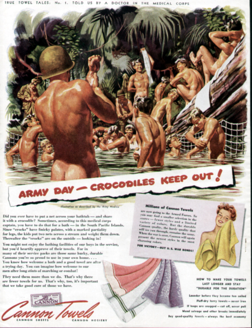
Accompanied by an illustration as described by an Army medic, “Army Day—Crocodiles Keep Out!”, Cannon’s True Towel Tales No. 1 (1943), is attributed to a doctor in the medical corps.  Did you ever have to put a net across your bathtub—and share it with a crocodile?  These naked soldiers might be smiling and having fun in the water but, according to their captain, sometimes you have to do that for a “bath” in the South Pacific Islands!  “You might not enjoy the bathing facilities of our boys in the service,” says Cannon, “but you’d heartily approve of their towels.”

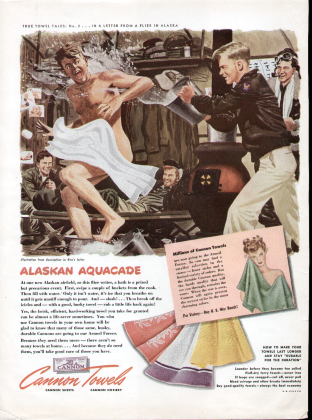
A half-naked airman is the subject of 1943’s “Alaskan Aquacade,” whose story was told in a letter from a flier.  Chased around by a smiling buddy who throws water at him from a bucket, the surprised Air Force pilot is literally showered.  A couple of grinning guys lounge nearby on the floor, under a rack of hanging uniforms.  “At one new Alaskan airfield,” recounts the flier, “a bath is a prized but precarious event.  First, swipe a couple of buckets from the cook.  Then fill with water.  Only it isn’t water, it’s ice that you breathe on until it gets unstiff enough to pour.  And—slosh! … Then break off the icicles and — with a good, husky towel — rub a little life back again!”  According to Cannon, the point is that “the brisk, hard-working towel you take for granted can be almost a life-saver sometimes.”  Especially when dealing with an “agent” that’s too stiff for comfort!

Marines are featured in the third True Towels tale.  In “…What? … No Bath Salts? …” (1943) even the illustration is based on a photograph supplied by the U.S. Marine Corps.  Here the action takes place in the Solomon Islands, where “it’s either the Pacific with a shark to tickle his pinkies—or the water-tank.”  When you’re “jungle-dirty” — as are these fighting men who take a break from battle to towel off and admire their handiwork — “the primitive water-tank’s a luxury,” claim our returned Marine heroes.  Fortunately, where towels are concerned, the bath isn’t that primitive because the “brisk, efficient (Cannon) towels you take for granted are welcome equipment to our men in all the services.”  Yep, welcome “equipment.”  Towels!

Showing members of a U.S. Tank Corps in North Africa taking a nude swim and sunbath while a soldier poses playing Julius Caesar, Cannon’s 1944 True Towel Tales #4 is based on an experience told by a sergeant in the Tank Corps.  Maybe the Roman bath was built for a conquering Caesar but in this advertisement it’s being used by “Joe Doughboy,” who’s enjoying a Roman holiday.  The holiday includes lots of men doing their best to “camp it up.”  When what ails you is the “Mediterranean heat and fight fatigue and pestering flies, a swim is welcome,” counsels Cannon.  Welcome, too, of course, is the brisk rub-down with a good towel from the good-towel company.

Now imagine yourself in boxer shorts, taking a bath with an elephant.  That’s the scenario in “Hey, Turn Off the Water, Jumbo!” Cannon’s True Towel Tales No. 5.  As told by a soldier, this 1944 ad shows Americans in Ceylon where an elephant hoses down the sailors with its trunk as natives wash the pachyderms.  According to the story, “…there’s a Hindu who lives near a river and owns an elephant.  When the hot season comes, he’ll send our shore-going sailors a shower-bath for less than a rupee.”  Of course, one has to bring his own towel!  Does the image of being hosed off by an elephant seem exciting … or appealing and tawdry?  “Me and my mates tried it,” sez the Sailor, “and ‘twasn’t bad!”  It’s different strokes for different folks as this ad goes to show that not everyone is comfortable with a jumbo hose, mate.

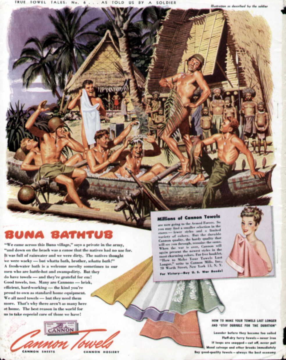
Fieldcrest Cannon’s final True Towels Tale (#6) was also published in 1944 and deals, again, with our Army men.  This time they’re center sage in an abandoned canoe, taking a nude bath while the natives form an audience.  As the villagers look on, a soldier playfully poses and vamps with a palm branch barely covering his body.  Is this a bath … the “baths” … or a drag show?  The canoe was full of rain water “and we were dirty,” explains the soldier.  “The natives thought we were whacky—but whatta bath, brother, whatta bath!”  Like the other ads in Cannon’s campaign, the men here seem to enjoy looking at each other’s nude bodies.  This ad in particular seems to focus on a man pretending to be in drag, entertaining the men — some sitting between each other’s legs.  One soldier looks on and whistles as, puzzled, the natives watch from afar.

Cannon’s strategy was an effective way to propagandize people to support the war effort, and provided some appealing eye-candy for women and the boys.  Despite what could be construed as racist images of “natives” looking on as the military men bathe, the message is clear: Our GIs are having a good time, keeping clean, and out of harm’s way.

 “The focus of these ads was on the value of Cannon towels to the soldiers, but the images were homo-erotic enough to allow for an alternate interpretation by a gay man,” says Edward H. Sewell (2005). 

Bear in mind that on the battlefield, as in other gender-specific environments (i.e., same-sex boarding schools or jails), the absence of women could possibly have allowed for a more liberal and freer expression of man’s primal needs … and that, given the circumstances, society generally may have been more willing to waive its condescension or condemnation of such activities.

Don’t Ask, Don’t Tell?

 “The war years had witnessed a sudden and dramatic change in the appearance of men in Life magazine,” writes John Ibson (2002) in Picturing Men: A Century of Male Relationships in Everyday American Photography.  “Men in various postures of intimacy had begun to appear in Life advertisements with remarkable frequency once the war was under way.  In several issues just before the conflict, in 1940, the magazine had depicted no adult men alone together, without women; by 1943 and 1944, only one issue had no such male-to-male interactions in advertising.”

The potent mix of masculinity and patriotism symbolized by soldiers and sailors has, in its biochemistry, fundamental elements of seminal appeal.  So, Cannon wasn’t the only company to employ homoerotic images in its advertising.

Nor was Cannon the only towel company to promote its products with advertisements featuring naked men engaged in activities, like doing laundry, associated with the gentler sex.  A stunning illustration in a 1942 ad for the Pepperell Manufacturing Company of Boston shows the “U.S. Hand Laundry” corps in various stages of undress, cleaning their clothes in a river.  With no washing machines or buttons to press, the muscular graphics undoubtedly drew admiration from men, as well as the attention of women.

Sacrificial Soldiers

Although a sense of free-spirited debauchery may be distilled from ads sponsored by Coca Cola, Pullman, Fisher (GM) Body Works, Armstrong Cork, Oldsmobile, Interwoven Socks, Listerine, International Harvester, and even Ma Bell, patriotism, sacrifice, and the welfare of our troops are all prioritized in these World War II ads …  whatever else can be inferred or implied.

Perhaps no other ad so succinctly represents this primordial tug-of-war between protecting our boys and allowing the men their sexual latitude in such critical times as “The Kid in Upper 4” sponsored by the New Haven Railroad and published between 1942 and 1943.  Immortalized by social historian Allan Berube (1990) in his definitive book on homosexuality in World War II, this ad has special significance:  “Life in sex-segregated quarters created homosexual tensions as well as opportunities,” Berube contends.  “A magazine advertisement illustrates how young recruits were placed ‘two in every lower berth’ on troop trains.”  Presumably, the kid in upper 4 is depicted alone, worried, and wide awake because he is so young, so angelic, so blond.  Poignant text about him leaving home and heading to war talks about what he left behind and what faces him ahead: “Next time you are on the train, remember the kid in Upper 4.  If you have to stand enroute—it is so he may have a seat.  If you have to wait for a seat in the diner—it is so he … and thousands like him … may have a meal they won’t forget in the days to come.”

What a tearjerker!  A gay man’s eyes moist over this ad even today, thinking about what may befall this beautiful boy in the upper berth once he arrives “over there.”

Madcap Male-to-Male Interactions among Military Men

Madison Avenue’s woofish sketches of warfare revolved around sweat-drenched soldiers surrounded by other fighting men (and, at times, natives) who are either smiling and sneering or leering and jeering as they hand off erectile projectiles — artillery, missiles, guns, cannons or swords — to their comrades and/or combatants in arms.

The men here may not have been alone in the trenches, but their demeanor — sometimes saucy, other times threatening — and the winsome wording of the ad copy could coalesce to produce a sexually provocative response from some men in the advertising audience. Bombastic, iconoclastic … and homoerotic … are words that would agree with these sabers-rattling ads.

A 1943 full-color ad by Fisher, then a division of General Motors, is headlined “Body blow by Fisher.”  Certainly the possibility exists for some double-entendre, especially as augmented by other ad copy here:  “Take care of that equipment … make it last … make it do.”  Beneath a blazing sky, this full-color advertisement shows a number of shirtless soldiers blowing off rigid cannons being both loaded and discharged.

That same year (1943), the National Dairy Products Corporation and Affiliated Companies issued its own call to arms with a smiling, jungle-based soldier “spoon-feeding” a hunk of cheese into the mouth of a cool, calm and collected military man from the Alaskan snows with a large firearm firmly balanced behind his bowls.  “When guns are hot and time is short, the emergency cheese ration can be eaten as it is—like a candy bar,” carps the copy.  “Or it can be mixed with a little water to make a tasty spread for bread.  Or the mixture can be set aside for an hour or so and then sliced.”  Sliced, spread or diced, America’s fighting men could cool their guns with (purportedly) tasty treats … even during emergencies!

Soldiers, some undressed and others in various stages of uniform, are also featured around a cannon that’s just shot a load in a full-color 1943 ad for Inter Woven Socks.  Nothing’s really outlandish here, although a queer eye looking beyond the (presumably) straight soldier guys will probably laugh at the headline:  “In Times Like These—Endurance Counts.”  While the socks may indeed be “Long Wearing … Comfortable … Good-Looking,” it would be most extraordinary if the battle-weary soldiers were wearing such lovely argyle, striped and solid color socks under their regulation boots and regalia.

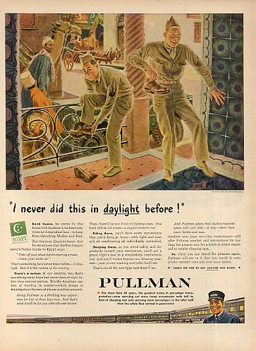
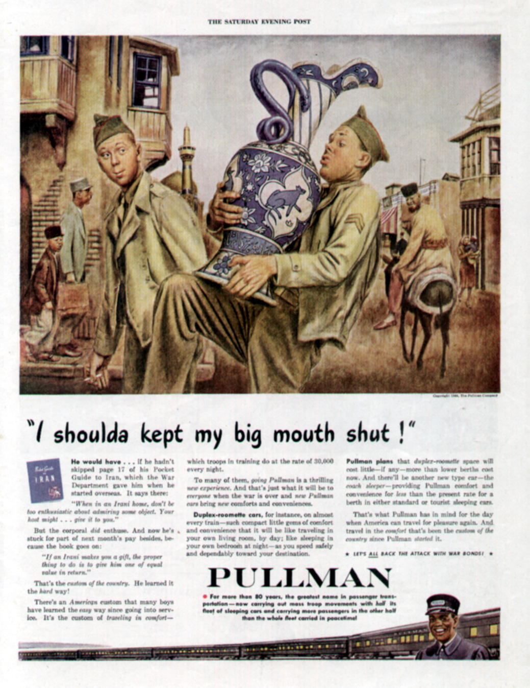
Pullman produced several ads in a series illustrated by Albert Dorne during 1944, when their passenger trains carried troops instead of people traveling for pleasure.  In one, two soldiers stationed in Egypt are trying to adapt to a particular custom of the country: taking one’s shoes off before entering a home.  But until we’re well into reading the copy, we don’t know that. Instead, as a native looks on suspiciously, two GIs guiltily remove their footwear in the threshold of a building.  The ad’s headline — “I never did this in daylight before!” — adds to the illicit sense that the soldiers have been caught doing something for which they can be discharged today.  “Back home, he came in the house with his shoes in his hand only when he’d stayed out late — to keep from disturbing Mother and Dad,” begins the copy.  The implication?  Possibly this: He might have been a good boy back home, but now he’s indulging his baser instincts. 

 A large piece of artillery from a crate of ammo in hand, another shirtless soldier with a somewhat skeptical but determined look approaches a uniformed GI in a jungle somewhere during the war.  As he brandishes the burnished shell at his comrade, the headline in an Armstrong Cork company advertisement screams:  “Listen, soldier, it just doesn’t make sense!”  Is the shirtless soldier menacing the other man, who’s attempting to talk him out of doing something unwarranted or outlandish?

Attempting to gain a sense and semblance of the action here, our eyes wander around the illustration.  There’s another soldier smack in the middle, watching what’s going on with obvious delight.  Behind him, almost hidden by the trees and foliage, other men stand in front of a cannon or, bare-chested, carry duffle bags above their heads.

Let’s now turn to the advertising copy here and read a conversation between Bill, Joe and Hank.  As it turns out, Bill is simply showing the shell to Joe so he can see the Armstrong trademark. Joe, whose father has been selling Armstrong Linoleum in his furniture store, can’t believe the same company manufactures weapons.  It’s Hank — the smiling soldier ambling up to them — who explains that the Armstrong companies make a lot of different products.

The graphics and headline of this attention-grabbing ad don’t come across as appropriate for a mild-mannered exposition on the “hundreds of diversified products” made by Armstrong. But that’s how an effective advertisement can work. Shock value grabs our attention as we sort out the pieces, seeking solution(s) to the advertisement’s purpose or message.  Appealing to our sense of fear — homophobia … a jungle setting … in the midst of a world war — this homoerotic ad uses language and images to create a complex yet compelling tableau.

Close-knit sailors — perhaps a bit too close for comfort — appear in a 1945 advertisement for Listerine Antiseptic, touted here as “the tested treatment” for infectious dandruff.  “Oh, yeah!  A month’s pay says it will!” bets the sailor on the right, referring to Listerine’s ability to get rid of the flakes and scales on his buddy’s jumper.  Head cocked aggressively with his face uplifted and an expression of bully daring about him, the sailor holds out some money in his left hand while his companion brushes the dandruff off his shoulder.  Chastised and chastened, chagrin is etched deeply across the downcast face and furrowed brow of the embarrassed sailor who’s ashamed to look his friend in the eye.  Although hardly effeminate, there’s something soft and feminine about the suffering soldier.  Here’s a twist, a role reversal from most (non-combat) advertisements of the time that show a man and woman — where she always tends to be the student to him as the teacher.  One guy learns an important lesson about personal hygiene from another in this ad.  How domestic and degrading for a military man!

Listerine had laid on a lulu of gay ambiguity in an earlier, 1943, ad:  By their body language, two bruising sailors appear to be doing some sort of cheerleading or mating minuet as they bend and bow in a bizarre ballet, looking cautiously at each other.  “Butch says don’t bring Lulu,” one tells the other in this 1943 ad for Listerine.  Leaning close, the sailor seems to be winking wonkshly while his buddy nervously looks around to see if they’ve been caught or observed together.  Turns out that little things disturb courageous men like these:  “Butch came through a couple of bombings and never batted an eye,” we learn.  But when it came to a second date with Lulu, “he wanted out.”  Sure, Lulu was a looker – with good “gams, and plenty of oomph.”  When shore leave is short, though, a man doesn’t want to spend it with a girl who’s got bad breath.  Listerine may have been part of their “passport to popularity,” but our money is still betting on Butch and his flag-waving buddy … leaving Lulu behind.

Epilogue     

After the war, titillating ads continued to appear with potentially hidden, coded, or ambiguous gay themes and messages.

“Monogamy at the Naval Academy: Now A Forced-Feeding Social Life,” proclaimed an ad promoting an upcoming story to be published in the March 1, 1958 issue of The Saturday Evening Post.  But to what kind of monogamous social life … and whose forced feeding … did the headline allude?

With 1,700 rooms and five miles of corridors, Bancroft Hall — “one of the largest single dormitories in the U.S.” — houses the Naval Academy’s entire brigade of 4,000 midshipmen, states Blaine Taylor (2005) in Military Heritage magazine.  Since Annapolis first accepted women as midshipmen in 1976, the purported lack of monogamy and potential erotic overtures among the men housed there tug at the intellect but boggle the mind.

“What will it take for a straight guy to go gay?” asks Kevin Cassell (2004). “Try just a few weeks in the United States Navy during a time when homosexuality was not just grounds for dishonorable discharge, but for a full-scale criminal investigation and, if found guilty, incarceration.  Yes, it happened: dozens of young, straight naval recruits ‘went gay,’ with no small degree of enthusiasm, at the Newport Naval Training Station in Rhode Island in 1919.”

Not a well-known fact, shares a friend, but “in the early 1950s, during the height of the Korean War, the military academies were being forced to turn out more officers than they had the capacity to house. Since most of the bunk beds were being shipped out to military barracks, the academies had to resort to double beds in their small rooms, and putting three cadets into a room with two in a double bed. This didn’t last very long when it was found out that the double beds facilitated some ‘buddy activity’ during the night when the bunkmates got familiar with each other. I don’t recall where I first learned this, and I’d certainly go look for a definitive reference before repeating it, but I’m 99% sure it’s true,” he said.

Despite McCarthyism and the myriad struggles predating Stonewall yet ahead, “gay” and homoerotic imagery — explicit or implied — made such headway during the World War II years that the roadblocks to real liberation throughout the advertising world would become fewer and farther between. 

But that’s the grist for another article … or, more likely, a series.

Retired communications professor, marketing director, and publisher Bruce H. Joffe has amassed an extensive array of media, management, and human resource experience, along with counseling and “people” skills. Fluent in Spanish and conversant in Portuguese, he has taught public relations, media, marketing, and journalism courses at The American University, George Mason University, Mary Baldwin University, Carthage College, and Kaplan College. The award-winning author of magazine features, academic research, professional journal articles, and newspaper byliners, he has published eight books: titles deal with marketing, the media, interfaith and progressive theology, church reform, gender studies, and international (intercultural) living/communication.

Processing…
Success! You're on the list.

Skivvies with the Givvies …

Vintage American Underwear Ads
Feature Sexual Innuendo between ‘Boys’ in the Brands

“Over the years, underwear has been associated with modesty — or with the lack of it,” points out Vintageskivvies.com.  “Underclothes are inextricably associated with morality, sensuousness, cleanliness, sexuality, hygiene and — sometimes — even social status,” claims the underwear retailer on the archival pages of its Web site: http://www.vintageskivvies.com/pages/archives/history/thetwentiethcentury.html.

The online retailer has a twist: In addition to its virtual store selling products with a sizing chart and posting its sales/return/shipping policies, along with a clickable list of brick-and-mortar underwear retailers, vintageskivvies.com features an archives section with articles, blogs, a glossary, history, and ad gallery all about underwear.  It’s the world’s first e-museum to focus on what men have worn under their trousers.

According to Vintageskivvies, undergarments “have had — and still have — important ‘psychological’ characteristics.  To understand this aspect of what we wear nearest to our skin, we have to view undergarments in the light of the epoch in which they were popular.”

It’s a complex topic, further complicated by the whims of fashion:

Then as now, advertising attempted to fulfill its raison d’etre by communicating the changes in underwear to consumers.  But in the process, it succeeded in doing more:  Explicit or implied, advertising incorporated homoerotic overtures, themes and subtexts within its messages.  Take the saga of B.V.D., for instance.

A Better View Designed

Founded in 1876 by three businessmen — surnamed Bradley, Voorhees, and Day — B.V.D. was first known for its men’s “spiral bustle” with long sleeves and legs made of a heavy knitted fabric.  In 1908, that bulky and tight-fitting garment was turned into a new, looser line of underwear.  B.V.D. then added a two-piece number and the popular “union suit” to its offerings.  With the ever-popular advertising slogan “Next to Myself I Like B.V.D. Best,” the company introduced a lightweight, waffle-like fabric, notes Esquire contributor John Berendt (1987).

Background on B.V.D. can be found on the company’s Web site http://www.bvd.com, in Wikipedia: http://en.wikipedia.org/wiki/BVD, and in “Undercover Artists,” a Time magazine article: http://www.time.com/time/magazine/article/0,9171,889224,00.html?id=chix-sphere.

Intrinsic to almost every B.V.D. ad produced between 1913 and 1926 is a pair of book-ended boys who seem to become increasingly involved with each other as their advertising adventures unfold.

 “The Fag-Free ‘Fans’ Wear B.V.D.” (Figure 1) published in 1913 features a crowd of people illustrated in cartoon-like fashion.  Headline and copy literally flow below the illustration to form a T-format layout with the two buddies in their B.V.D.s placed symmetrically in ovals aligning the copy as somewhat mirror images. Though obviously interested in each other, the B.V.D. boys are young, fresh and still relatively innocent.  “Cool and comfortable despite the grueling heat, the fag-free ‘fans’ in the foreground wear Loose Fitting, Light Woven B.V.D. Coat Cut Undershirts and Knee Length Drawers, or Union Suits,” states the copy.

Following their fag-free outing, the buddies are back in 1914 with another ad that, again, fits them to a “T.”  This time they appear cool, calm and collected below a bunch of chums struggling to enjoy their vacation from the stifling summer heat.  “No Fun,” Says He, “Unless You Wear B.V.D.”  It’s not precisely clear who the speaker is in the headline here, but, for argument’s sake, let’s assume it’s one of the smiling guys lifting the boat out of the water.  If so, he’s facing the seated lad who’s uncomfortably wiping sweat off his brow, tie undone and hat on his knee, a duffle bag on the ground beside him.  The plot thickens as we continue reading the copy: “Get the full fun out of your vacation in B.V.D.  If you’re cool, work is play, and either side of the road is the shady side.”  Either side of the road is the shady side?  Could this possibly be construed as referring to men who like their sex both ways, with women … and with men?  Probably not – at least not at the time; but it’s something today’s reader might consider. 

The boys are joined by others seeking comfort at Camp B.V.D. in a 1915 ad.  Though a line in the advertising copy – “It’s the Underwear of red-blooded, right-living men who find clean fun in keen sport” – conjures up images of fundamentalists denigrating what Arnold Schwarzenegger has called “girly-men,” taken as a whole cloth, this advertisement is both welcoming and inclusive.  From a man in business attire to another wearing more casual dress (and, of course, the emblematic B.V.D. boys in their cool and comfortable socks, sneakers, and undergarments), the environment, as the clothing, “won’t bind or irritate.”

In other ads published during these years, the B.V.D. lads visit the movies, take a train ride, go cruising on an ocean liner, fish, play a game of shuffleboard, avoid the summer’s stifling heat … and just lounge around enjoying being together.  The loose-fitting, light woven B.V.D. underwear teaches them the fine art of “Take-It-Easy,” as in a 1916 ad where they’re admiring each other while holiday travelers hustle and bustle about in an illustration above them. Wherever they are and whatever they’re doing, there’s one thing they both agree upon … the B.V.D. slogan:  “Next to myself I like ‘B.V.D.’ best.”  A bit conceited and self-serving?  Perhaps.  But, to B.V.D., they’re obviously worth the words and congenial compliment.

The graphic “T” layout returns in an 1917 ad in which the B.V.D. boys continue to enjoy each other’s company (at the bottom of the ad) while a baseball game is played above.  Any question about the appropriateness of the appreciation the B.V.D. boys may share for each other is overshadowed by the ad’s striking athleticism, in which a batter and catcher face a crowd full of fans.

Recreation is also the theme of a 1917 ad where our buddies, crisp as cucumbers, relax in their underwear.  Above them, a park filled with people swelter wearing parisols and hats.  The boys, as always, are at their best “physically and mentally,” because their B.V.D.’s “cool, clean touch helps take your mind off the heat, as well as the heat off your body.”  When you’re hot you’re hot; when you’re not, you’re not, n’est-ce pas?

Whatever the temperature might be outside (or in), the relationship between the B.V.D. boys has heated up by the time they appear in a 1919 ad.  While still separated by the copy between them (below), their thoughts are on the two men pictured (above) who’d be too close for comfort in other circumstances or surroundings.  Here, however, they’re quite at home … ready to turn in and spend the night together.

As World War I raged, a 1918 B.V.D. ad reminds us that “the comfort of the individual must come second to the need of the nation.”  Back then, even government requirements urged all citizens to “please be tolerant,” since undergarments weren’t as freely available as previously.  The consequences of such a shortage surely must have created a challenge, as well as untold possibilities.  Even though the B.V.D. boys by now have been liberated from their chaperones, spectators and companions – they appear alone (without even a “double-date”) from this point on in B.V.D. ads – it’s comforting to know, especially given the circumstances, that their undergarments haven’t been sacrificed to the war efforts.

Somewhat older and a bit more mature in a 1920 ad (Figure 2), our buddies are seeing red as color is added to the B.V.D. advertisement.  Perhaps it’s a registration problem with the printing press or process, but our protagonists appear to have rouge on their cheeks … and the man on the left has obvious traces of red lipstick on his mouth.  Nobody overseeing their activities, the guys are in close proximity in front of a phonograph.  One’s holding onto the Victrola, the other has a vinyl record in his right hand with his left hand resting atop a nearby chair.  Smiling, both seem to be happy in their underwear—alone yet together.  The man with darker hair (on the left) has his undershirt unbuttoned from top to bottom, although the buttons fastening his bottoms are completely closed.  Is this a “pajama” (underwear) party?  Are they preparing to spend another night together by setting the tone, tenor and treble for a possible paso doble?  Clearly, they approve of the music selected.  Is it time for an encore?

In this continuing B.V.D. soap opera whose storyline could track a progressive relationship between these two buddies, can a later (1921) ad showing them in the same underwear as the earlier (1920) ad be an allusion to the morning after?  It looks like the one on the left is holding a note in his hand as his line of vision heads directly towards his partner’s crotch. What’s more, a small inset of his posterior may hint of another view they’ve shared together. His undershirt still unbuttoned, feet sheathed in slippers, one of the boys holds onto a bathrobe.  Has he just taken it off … or is he about to put it on?

Two other 1920 advertisements for B.V.D. merit a mention.  In both, the boys again are alone in their underwear. 

In “Longwear,” the man on the left holds out what looks like a tennis ball, inches from his buddy’s lips.  It’s a gesture reminiscent of Eve tempting Adam with an apple and one almost expects to hear that “the serpent beguiled me and I did eat.”  Copy in this ad seems rather defensive or competitive, making the point that you get a lot for your money with the B.V.D. brand:  “Materials of enduring strength and workmanship of scrupulous care make B.V.D. wear far beyond what it is fair to expect.” 

The second 1920 ad, “Quality,” refers to it being a “tradition with its makers and a proverb with its wearers.”  While it might be a proverb for other wearers, our boys here seem to be scanning the morning newspaper instead of reflecting on their Bibles. 

Looking almost angelic and cherubic, the B.V.D. boys pose in front of a Christmas tree inside a home parlor in a 1924 ad.  Despite any pretense about what they’ve been doing together, undressed except for their undies, they’re obviously comfortable and at ease.  Though the headline copy reiterates the slogan, “Next to myself I like ‘B.V.D.’ best,” one has a sneaking suspicion that what (or who) each really likes best next to himself isn’t an undergarment—B.V.D.s or any other brand!

Modeling their starchly-pressed union suits, our own Betty (blond) and Veronica (brunette) are warned to “Look before you leap!” in a 1925 ad.  To their right, sketchy cartoonish characters incautiously jump off a diving board onto the beach below.  But they hold little interest for the B.V.D. boys, who are immaculately attuned to each other.  The “‘Looking for the label’ after you’re sorry won’t change it to ‘B.V.D.’” subhead is a curious reminder during our current era of STDs, HIV and AIDS to use protection and practice safe sex rather than suffering the potential consequences later.

In 1926, the B.V.D. ads took on a new look with illustrator Walter Jardin.  Artwork is sketchier, with less emphasis on the earlier style of portraiture or classical realism.  The ads, here one-third instead of full-page, are smaller but contain almost the same wording and copy in their texts and headlines.  To be sure, the type and font is similar … but the focus remains on both B.V.D. boys. 

In one 1926 ad they’re in a park or forest, again spinning records and enjoying music.  Flies, ants, bugs and bees don’t bother these two, even as dressed only in their underwear.  “The test of underwear comfort is to be able to forget you have underwear on,” advises the ad copy.  Somehow, one doesn’t think that’s an issue for these buddies in their B.V.D.s.

A second 1926 ad places the boys inside a house … maybe in a parlor, living room, or sitting room adjoining a bedroom.  The men appear ready to call it a night and head off to bed, as a bathrobe is about to slip off one of their arms.  “Every Time You Dress give yourself the delight of slipping into cool, fresh B.V.D.”! headlines the copy.  Given the implications of the illustration, however, a slight variation might make for a more appropriate title and lead copy: “Every Time You Undress, give yourself the delight of slipping out of cool, fresh B.V.D.”! 

Battles among the Brands

B.V.D. wasn’t the only brand courting the male underwear market in the 1920s.  Other makers included Duofold, Hanes, Hatch, Madewell, Munsingwear, Navicloth, Superior Underwear, and Topkis.  Unlike today’s sensual poster boy exhibitionists in their Calvin Kleins, underwear wasn’t always attire for the fashion-conscious male. Instead, men sought comfort and value from the clothing that came closest to their skin.  And, maybe, a psychological pick-me-up from their advertising, too.

“All a man used to seek was some sort of underwear that would not bulge, bind, gap, chafe, or sag,” says vintageskivvies.com on http://www.vintageskivvies.com/pages/archives/history.html, “something that — when hung out to dry — would not attract enemy fire.” 

“Oil paintings of men in their Kenosha Klosed Krotches by Saturday Evening Post artist J.C. Leyendecker were daring for 1911 and made history as the first national print ads for men’s underwear,” according to the web site, http://www.vintageskivvies.com/pages/archives/history/theteenyears.html.  “Most of the [m]en [s]hown in early underwear advertisements were fellows who ‘Put hustle in the tussle!’ as the Superior Underwear Company put it, men who were likely to put a lot of ‘strain’ on their undergarments.” 

A cute 1915 Wilson Bros. ad, for example (Figure 3), advances the company’s undergarments with two men in their Athletic Union Suits out on a dock of the bay casually shooting the breeze and smoking pipes.  Neither appears to be embarrassed or self-conscious about doing something out of the ordinary as they chat and relax outside dressed only in their underwear.  (A tall wooden wall does partially hide them from potential onlookers.)  “Seat opening cut generously full for greatest convenience,” states the copy, neatly positioning one of the product’s prime benefits.

“Sold in a Cleaner Way” was the distinguishing characteristic of Sealpax Athletic Underwear for Men.  Surrounded by admiring male fans in the bleachers, an athletic underwear champion jumps over the Cool and Clean sidelines holding honors in hand in a 1921 Sealpax ad loaded with homoerotic innuendo:  “‘Boy, oh Boy,’ you appreciate Sealpax when you’re mixed up in a crowd, when it’s hot—and stuffy—and everybody ‘round you is sweltering.  Sealpax keeps you cool as a cucumber.  It’s that kind of underwear—built for man-sized comfort.  Cool because the fine nainsook fabric is cool—comfortable because it is cut to follow the movements of your body—no chafe—no irritation—the coolest, finest underwear a man can slip into.”  But the best thing about the underwear is the brand’s package:  “Sealtex is better athletic underwear and it is sold in a cleaner way—packed in the individual Sealpax envelope which keeps it as fresh and clean as the day it was made and laundered.”  Not unlike today’s prophylactics, that sanitary covering was salutary and undoubtedly appealed to health-conscious men.

That same year (1921), Hatch advertised its one button union suit with a two-thirds page black and white ad (Figure 4).  Two pretty men standing very close to each other draw all eyes to their interaction.  With an hourglass body, the one on the left has his right hand on his hip in a most unmanly manner.  Meanwhile, the man on the right has his right hand on the other’s shoulder and his left touching the man’s chest.  The way they’re drooling over each other as caught at this snapshot in time leaves little question about what’s on their minds and what they intend to do about it. 

The Focus Shifts

As the industry turned the corner, making inroads through the 1920s, its emphasis began to shift towards convenience, comfort, and value.  Perhaps no other company better synthesized these concepts in its market positioning as Topkis Athletic Underwear. 

If B.V.D. had its boys preening and admiring each other as the company’s advertising developed, Topkis — whose very name conjures up a talisman capable of girding one’s loins — distinguished the different men pictured in each of its ads not as playful, peek-a-boo boys but more mature and fully functional men capable of carrying on life’s affairs and, perhaps even, a relationship with each other. 

Moreover, B.V.D. may have been the market leader in men’s underwear back then but Topkis had its own marketing strategy and unique selling proposition: value.  In fact, nearly all Topkis ads emphasized how much quality you got for just a dollar!

A young man formally dressed in a suit, white shirt and tie sits backwards on a chair ogling another youthful gentleman wearing only his underwear in a half-page, black-and-white Topkis ad published in 1921.  Even though it’s only early fall, the headline warns, “Your skin must breathe in winter, too.”  Mid-way through the copy, however, we find out that “The way to let your skin breathe properly is to wear the Topkis Athletic Union Suit all year ‘round.”  Soon, the brand’s positioning statement appears: “It’s the biggest underwear value your dollar ever bought.”  That being said, a rationale for the graphics still must be questioned:  Why are two young men — one fully attired, the other only in his underwear — sitting that closely together and smiling so playfully at each other?

Unlike the iconic B.V.D. boys who appeared in each of the brand’s advertisements we’ve seen, different men participate in the action of Topkis. 

Once again, a fully and formally clad gentleman is seated backwards on a chair and seriously contemplating a young man — this time standing with a brush in his right hand, his left hand ruffling through his hair — in a 1923 ad of the same size and graphics.  The Topkis positioning statement is prominently articulated in the headline: “You can’t beat Topkis at double the price.”  Advertising copy continues to belt home the fact that, regardless of the price, no athletic underwear beats Topkis for quality or value.  Succinctly stated at the end of the ad:  “Why should I pay more, when I can get Topkis for a dollar?”  Copy is convincing and market-driven.  But what’s the story of the two men in the picture?  Why does it seem that one is standing in the footlights, “auditioning” for the other?

“Topkis is worth lots more than a dollar,” insists the headline of another Topkis ad, also published in 1923 (Figure 5).  Evidently, the handsome man looking intently at the binoculars he’s holding — possibly a gift from the chap dressed to the nines in a sailor’s jacket, cuffed slacks, cap, white shirt, and bowtie who’s seated in front of a ship’s porthole — is worth lots more than a dollar, too.  From the following copy, it’s obvious that the clothes-horse is used to paying the price for what he wants and that he’s used to having his way:  “An athletic union suit has to be a good bit above the average to satisfy me,” he says.  “It must fit me without either skimpiness or bagginess — the material must be of good quality — and I insist on long service.”  We learn a bit more about him, too, in his following revelation: “I’ve been accustomed to paying fairly stiff prices to get the kind of underwear I want.  But no more!  Topkis gives me everything I could ask for—and at One Dollar!”  Are the binoculars a gimmick or prop … or are they a bribe, a teasingly tempestuous toy that will figure more prominently into whatever may happen next between these two swains?

The beat goes on as another debonair young man, hat in hand, admires the virgin-white Topkis athletic underwear exposed when his cute friend removes his bathrobe.  Unlike the previous ads, both men are standing here.  This half-page ad, which ran in 1924, bears the headline: “Dollar Topkis worth more say the men who wear it.”  Why, just ask any man who wears it and he’ll tell you “the way to be sure of getting the most for your money when you buy underwear is to look for the famous Topkis label.”   Maybe that’s what the well-groomed dandy is looking at here: the Topkis label?  But where, exactly, is that label?  Following the gentleman’s line of vision, the label must be directly below the belly button, somewhere above the crack in the shorts!  

Two months later, Topkis ran a half-page ad featuring two other men.  A hunky stud in all-white undies begins to unbutton his athletic underwear in the April 1924 ad’s foreground, as a shorter and somewhat stoical cohort — maybe his butler or valet? — is standing nearby.  Dressed in dark colors, he uses a brush to remove any lint from the jacket he’s holding.  For some reason, the guy appears subservient and not too happy.  Maybe it has something to do with the book on the bench between them with its pages open to a particular passage?  Though the darker man’s face has turned in the direction of his client or patron, he stands with an arched back angled away from him.  “One dollar — and a dollar never bought more value,” heralds the headline.  Perhaps any acrimony (rightly or wrongly) perceived in the ad can be attributed to the following copy.  “No good dealer asks more than One Dollar for Topkis.  Many will tell you it’s worth more.”

And the Boys in the Brands Played on …

As the underwear battles continued throughout the 1920s, one maker’s attributes and the qualities that set it apart from another manufacturer’s jockeyed for market position.  Whether it was Wilson’s, Hanes, B.V.D. or Topkis, the boys in the brands played on.     

Hanes had the anti-squirm shorts with the seamless seat, but Topkis underwear boosted the roominess, allowing men to move in comfort:  “Why, man, Topkis lets you forget you have underwear on!  Fit?  It sure does!  Roomy, easy — never a hint of skimpiness anywhere,” claimed a company ad published in 1921.  “In your most active hours or work or sport, as well as your moments of rest, Topkis gives your body full freedom.  Seats open easily.  Drawer legs don’t creep up.”

About a decade later, in a statement to fashion-conscious men of the time, an Arrow underwear ad (Figure 6) appearing in the Spring 1933 issue of Apparel Arts: Fabric & Fashions skirted the delicate line between being Gay … but not too gay:  Two handsome jocks in a locker room (either dressing or undressing) evidently are pleased with the virtues of their underwear.  “And now the Shorts with the Seamless Crotch go Gay!  (BUT NOT TOO GAY),” we’re happy to learn from the headline, as the text’s message extols the “greatest contribution ever put in shorts—the seamless crotch.”

 After all, who wouldn’t be glad to say goodbye forever to binding … bunching … climbing … and cutting?  What’s more, Arrow now has taken its seamless crotch to new heights of haute couture by adding color “that makes men blush in the locker room,” according to the ad.

Homoerotic or Simply a ‘Gay’ Trompe L’Oeil?

Advertising is typically designed to convince us to buy a specific product or service, whether for the first time or by switching brands.  In pursuit of consumers, themes such as vanity, vitality and pleasure are strategically communicated.

So, what can we conclude from these early years of underwear advertising … before gay-specific images became so prolific?  That ads infused with same-sex imagery and intimacy simply stood out and caught the readers’ attention because they were oddly dramatic or hinted at homoerotic themes?

Or is it all but a devotion to smoke and mirrors, a razzle-dazzle gay trompe l’oeil?  Exploring, explaining and extolling the homo-eccentricities of these ads, perhaps what we see here is just a curious byproduct of the author’s misguided imagination?

No; the trail of evidence is quite clear: Discount, if you will, some of these ads as funny fabrications and fantastic stretches of the imagination.  Remaining is a large number of advertisements that, without question, are indicative of sexual and/or emotional intimacy and contact.  They’re more than a matter of pure camaraderie or platonic companionship between members of the same sex.

These men’s underwear ads from the early 1900s are suggestive … with homosexual imbroglios and innuendo teasing at us amid the subliminally seductive elements perceived and quixotically portrayed.

Obviously, the time wasn’t right for Madison Avenue to launch a concerted effort to court and woo the homosexual consumer … for this market and constituency didn’t yet dare to speak its name.  It wasn’t defined or measured and the power of its purse strings hadn’t been imagined — qualitatively or quantitatively.  Nor were the media yet in place to target the community of gay consumers efficiently, effectively … or even legally!

Looking back at them now through the trajectory of time and prism of exposure, we’re tempted to presume that some of the people — or activities — depicted were, in fact, Gay … or, at least, given the circumstances, that they found themselves involved in actions, activities, situations and/or environments we’d label today as “gay.”

“Even in ads intended to appeal primarily to heterosexuals, there may be a homosexual subtext,” opines journalist Georgia Dullea(1992).  

Now that’s the real givvies on the skivvies!

A Professor of Communication focused on Gay and Lesbian Studies, Bruce H. Joffe taught such courses as “Foundations of Gay & Lesbian Studies” and “Studies in Gay and Lesbian Communication” at George Mason University (Fairfax, VA) before relocating to Virginia’s Shenandoah Valley and joining the faculty of Mary Baldwin College (Staunton, VA) where he continues to explore sexual minorities, the media, and cultural norms.  This article is based on the research Dr. Joffe conducted for his book A Hint of Homosexuality? ‘Gay’ and Homoerotic Imagery in American Print Advertising. 

Processing…
Success! You're on the list.